elka collective
Melbourne women’s fashion brand Elka Collective creates beautifully-wearable feminine garments in natural yet luxurious fabrics. When aplin creative was asked to transform their Chapel Street store, the brief was to create a space that reflected their clothing’s unique aesthetic while creating a complementary backdrop to showcase it against.
Located in Melbourne’s iconic shopping district, Elka Collective’s flagship store lives and breathes natural tones and textures with a high-end, minimalistic flavour. In the same way the label layers textures and finishes together in their garments, aplin creative has blended natural marble, sandstone, lime render and rich timbers to create an earthy canvas with a unique European twist.
We selected luxurious natural materials that, like the Elka clothing line, are delicate yet timeless. Terracotta tiles reclaimed from the roofs of abandoned historic buildings in Eastern Europe add authenticity to the fitout. Seamless detailing creates a sophisticated and minimalistic space, while the considered selection of natural materials and artisan application add a human touch to the beautifully-constructed space.
When it comes to the final touches, no detail has been spared. A carefully-curated range of local designers complements Elka Collective’s ‘homegrown’ ideology. Attalos pendant lights created by local industrial designer Coco Reynold are used throughout the space, while Ross Gardam’s Melbourne-made Nebulae chandelier hangs pride of place in the centre of the store.
You can visit Elka Collective’s flagship store at 83 Chapel Street, Windsor, Melbourne.
2020 Finalist in BEST AWARDS
red rabbit
Sydney’s dining institution, Claude's, was closed in early September, the latest victim of Sydney’s push towards mid-market restaurants. Claude's reopened in late September as the pan-asian Red Rabbit. The Red Rabbit has turned the fine dining institution into a fun, vibrant, colourful take on modern Asian.
aplin creative was proudly appointed to lead the transition.
The design brief was to simply turn the existing restaurant on its head, and add the Flavour, Colour, Creativity and Culture that it was lacking. The inspiration was found in the flavors and colours of Asian cuisine. Modern Asian art and culture were also used to inspire an exciting environment.
The colour pallet was bold, but clean and controlled. The selection of colours, detailing and finishes were directly from Asian influences. The textures were references to the urban environment of modern Asian cities. Graphics and branding were used to introduce the creative culture that the restaurant atmosphere and cuisine reflects. The furniture and fixtures were all selected with consideration to the interior and the different uses of the bar and dining levels.
The FACADE was painted in a bold red paint with detailing in black and polished bronze. Strong branding helps the facade stand out in its prominent location on Oxford Street.
The LEVEL 1 interior is the bar and casual dining. This space is vibrant and fun. The bar is the main feature where clients interact, dine and enjoy a glass of wine. The complex space was cleaned up and simplified. We added a subtle texture to the main wall and additional lighting to play with shadowing. Behind the bar we used graphics, custom wall coverings and retained the existing mirrors to create a strong and fun feature. The custom wall covering which you follow up the stairs, makes you feel as if you are exploring a darker, different area of the restaurant, then when you emerge, you have arrived on LEVEL 2.
LEVEL 2 is the main dining area. This area was opened up, the soft furnishings were replaced with new solid timber furniture in a dark wenge stain. The space has been simplified and cleaned up and now the focus turns to the bold features that add the fun and culture to the Red Rabbit. Again the use of strong branding helps reinforce the underlying themes within the space.
SABA
Fashion meets interior design in new SABA showroom
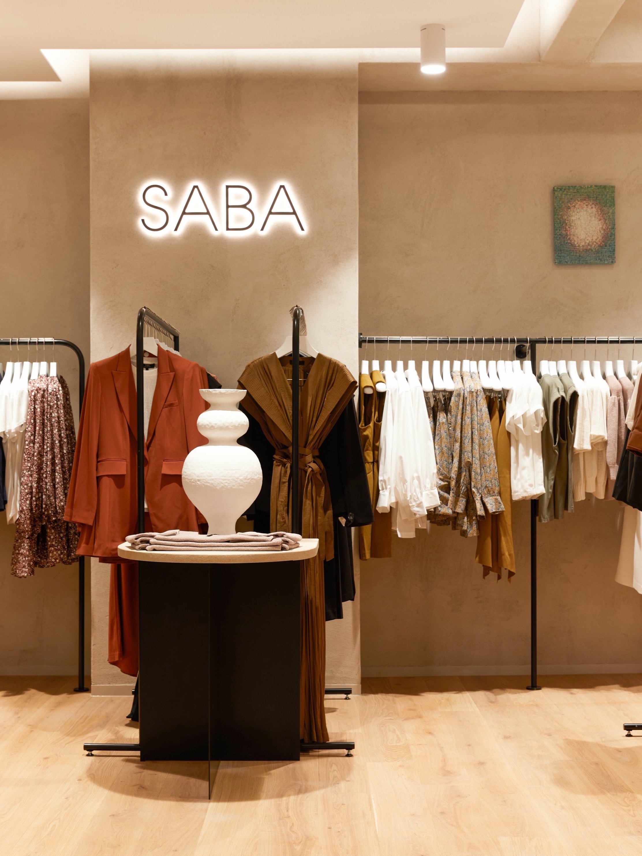
When luxury Australian fashion retailer SABA decided to open a flagship store, their brief matched the heart of their brand: modern simplicity, intelligent and sophisticated, and inspired by art and design.
SABA wanted a space that reflected their unique design aesthetic while creating a complementary backdrop that showcased their seasonal ranges of elevated modern staples for men and women. The result is a unique, curated space that carefully considers the entire SABA ethos, right down to its brand pillars.
aplin creative focused their design on luxurious yet earthy materials. A natural render to the walls and fixtures creates a delicate handmade backdrop while timber adds a touch of warmth and nature to the space. Australian sandstone draws a premium local touch indoors while simultaneously grounding the brand into its roots. Seamless detailing throughout the store effortlessly draws all design elements together, delivering a sophisticated and minimalistic space that successfully makes SABA’s designer clothing the heroes of the space.
What was left out of this space was just as important as what was put in. Because this was a new direction for SABA, the project centred on considered, restrained decision-making that ensured the overall brand ethos remained at the heart of the final result.
Much like the clothing that SABA designs and produces, this is a space that oozes style that lasts. You can find the new SABA store at Westfield Sydney.
urban beauty
When Urban Beauty, a beauty salon at Westfield Warringah Mall in Brookvale, Sydney decided to undergo their own makeover, they came to aplin creative.
The brief was to create a clean and modern space that seemed lofty and inviting, including two treatment rooms and a tanning room. The problem? The space was very small – just 38m2 – which left minimal space for a reception area and access between each room, so we designed multiple configurations before settling on one that was functional yet aesthetically pleasing.
Clean and modern is what you get before you even step through the doors. Inspired by urban dwellings, the shop front has been clad with curved timber shingles that create a welcoming and uniquely fresh introduction. The clean white paint and subtle colour softens the space and ties into the Urban Beauty branding.
Inside, the salon feels much bigger than it really is. To make the space feel lofty and open, the ceilings in the reception area have been lifted as high as possible, and white walls open up the space even more. To create a more cozy and intimate feeling inside the treatment rooms, the ceilings are lowered again. Timber finishes throughout including warm oak flooring, furniture and fixtures give the salon a clean and modern Scandinavian look.
Because the budget for this project was limited, we designed an efficient layout that reduced the need for major building, plumbing and electrical works. We retained the existing shop front too, but freshened it up by recladding it and building a new door. The result is a fresh and welcoming oasis from the hustle and bustle of everyday life that optimises space.
For more information about Urban Beauty, visit their website. To find out how aplin creative could give your work space a makeover, contact us now.
SEE MORE
zeus street greek
When you think ‘kebab’, you often imagine late-night hangover cures rather than healthy, flavoursome meals. Zeus Street Greek is reinventing the perception of classic Greek cuisine with its rollout of new restaurants right across Australia. Traditional Greek street food is combined with the best local produce and set in a relaxed, contemporary environment to create fresh, healthy, casual dining that’s delicious any time of the day.
aplin creative worked with hospitality experts DS17 and the Zeus team to help deliver the look and tone for the brand, along with documenting the fit out of each restaurant. While every site is different, they all have the same Zeus DNA: a love of eating great food with great people. Simple lines, exposed brick, reclaimed timbers, distressed cement and wooden tables give each restaurant that modern industrial feel while bringing the outdoors in. Bold and mismatched patterns like chevron and spots complement stylish white subway titles and black finishings to add a touch of finesse to each restaurant.
Zeus restaurants are currently expanding right across Australia. Visit www.zeusstreetgreek.com.au to find out more.
red rabbit
Sydney’s dining institution, Claude's, was closed in early September, the latest victim of Sydney’s push towards mid-market restaurants. Claude's reopened in late September as the pan-asian Red Rabbit. The Red Rabbit has turned the fine dining institution into a fun, vibrant, colourful take on modern Asian.
aplin creative was proudly appointed to lead the transition.
The design brief was to simply turn the existing restaurant on its head, and add the Flavour, Colour, Creativity and Culture that it was lacking. The inspiration was found in the flavors and colours of Asian cuisine. Modern Asian art and culture were also used to inspire an exciting environment.
The colour pallet was bold, but clean and controlled. The selection of colours, detailing and finishes were directly from Asian influences. The textures were references to the urban environment of modern Asian cities. Graphics and branding were used to introduce the creative culture that the restaurant atmosphere and cuisine reflects. The furniture and fixtures were all selected with consideration to the interior and the different uses of the bar and dining levels.
The FACADE was painted in a bold red paint with detailing in black and polished bronze. Strong branding helps the facade stand out in its prominent location on Oxford Street.
The LEVEL 1 interior is the bar and casual dining. This space is vibrant and fun. The bar is the main feature where clients interact, dine and enjoy a glass of wine. The complex space was cleaned up and simplified. We added a subtle texture to the main wall and additional lighting to play with shadowing. Behind the bar we used graphics, custom wall coverings and retained the existing mirrors to create a strong and fun feature. The custom wall covering which you follow up the stairs, makes you feel as if you are exploring a darker, different area of the restaurant, then when you emerge, you have arrived on LEVEL 2.
LEVEL 2 is the main dining area. This area was opened up, the soft furnishings were replaced with new solid timber furniture in a dark wenge stain. The space has been simplified and cleaned up and now the focus turns to the bold features that add the fun and culture to the Red Rabbit. Again the use of strong branding helps reinforce the underlying themes within the space.
zeus street greek
When you think ‘kebab’, you often imagine late-night hangover cures rather than healthy, flavoursome meals. Zeus Street Greek is reinventing the perception of classic Greek cuisine with its rollout of new restaurants right across Australia. Traditional Greek street food is combined with the best local produce and set in a relaxed, contemporary environment to create fresh, healthy, casual dining that’s delicious any time of the day.
aplin creative worked with the Zeus team to help deliver the look and tone for the brand, along with documenting the fit out of each restaurant. While every site is different, they all have the same Zeus DNA: a love of eating great food with great people. Simple lines, exposed brick, reclaimed timbers, distressed cement and wooden tables give each restaurant that modern industrial feel while bringing the outdoors in. Bold and mismatched patterns like chevron and spots complement stylish white subway titles and black finishings to add a touch of finesse to each restaurant.
Zeus restaurants are currently expanding right across Australia. Visit www.zeusstreetgreek.com.au to find out more.
billabong sydney
BILLABONG, the world’s largest surf lifestyle brand opened its premium flagship store in the center of Australia's busiest and most cosmopolitan shopping precinct, Pitt Street Mall, Sydney. aplin creative was proud to be the designer of this iconic store.
The store is 550M2 over two levels of exciting retail space. The first level is the smaller of the two and dedicated to women. The goal was to create a light, fresh space with a strong coastal theme but hang onto that Sydney urban edge. The clean white walls and white timber cladding is the backdrop for the vibrant merchandise and is complemented by selected lifestyle graphics. The urban edge is introduced in the cement flooring and selected use of reclaimed bricks. Blonde timbers soften the space and bring you back to the beach.
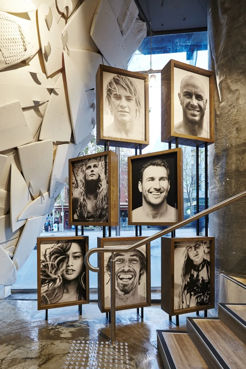
The large central spiral staircase became the centerpiece of the store and we developed the ‘Athlete Tribute’ feature to encourage customers to explore. The tribute frames are made from stacked ply boxes that hold an image of each of the brands athletes and ambassadors. This feature wraps around as it draws you up the stairs with the hero’s of the surf industry leading you onto the second level.
The second level boasts 8M+ ceiling voids that make for a vast open space with amazing natural light flooding in from the extensive full height windows. The challenge for this space was to keep the natural light but make the space feel intimate. We did this by lowering the light fittings and other ceiling features. These features are taken from the new direction of the ‘BILLABONG’ concept. The ‘reclaimed surfboards’ together with the lighting, creates an amazing texture.
The design of the second level follows the same themes of level one but targeted towards men. The white timbers were replaced with black timber and the floor is a dark rustic timber. There are still elements of the urban theme including cement pillars and ceiling, and the selected use of mesh and raw steel. Throughout the consideration to the brand is paramount.
It was a privilege to be involved in designing this store for a world-renowned brand in such a fashion conscious city. We have made our mark with the new generation look of this store, turning it into a more sophisticated shopping experience but still keeping the iconic ideology of the brand throughout.
elka collective
After redesigning their flagship store on Melbourne’s Chapel Street, Elka Collective commissioned aplin creative to design their second boutique too, this time in an old terrace building in Brighton.
Elka’s signature style and muted earthy tones, reflected in both their high-end fashionwear and their Windsor store, continues throughout their new concept space. The old building originally featured a series of individual rooms which aplin opened up to create an airy showroom in which to display both Elka’s wares and a carefully-curated selection of lifestyle brands. Rich timber floors, brick and lime-rendered walls, and stone cabinetry create a natural yet luxurious design palate, while Windsor’s European-inspired curved walls and arched doors make an appearance here too. Timber-lined walls add a sense of opulent luxury to the changing booths while sleek yet simple clothing rails and exterior signage add subtle minimalism to the overall design.
You can visit Elka Collective’s new store at 68 Church Street, Brighton.
PHOTOS: Danielle Castano
2020 Finalist in BEST AWARDS
billabong wollongong
BILLABONG, the world’s largest surf lifestyle brand is heading in a new retail direction and aplin creative is proud to be appointed the designer for this transition.
Giving the shop front simplified appeal was crucial to help the brand define itself. The shop front for the brand has long been an iconic black timber. This was retained but in a more sophisticated manor. We extended the iconic black timber back into the store to make a threshold or band of solid black. Slate flooring complements this timber portal. We used beautiful oak lining boards with black stain to achieve this bold entry. The finish of this timber has a strong visible grain and texture but is very clean at the same time. The branding of the store was another example of adding sophistication to the shop front. We finished metal letters in a black nickel and illuminated them with strong back lighting to make them stand out. The black on black branding is a confident, clean and bold statement for Billabong. Digital media and a basic but well merchandised window display complete this striking shop front.
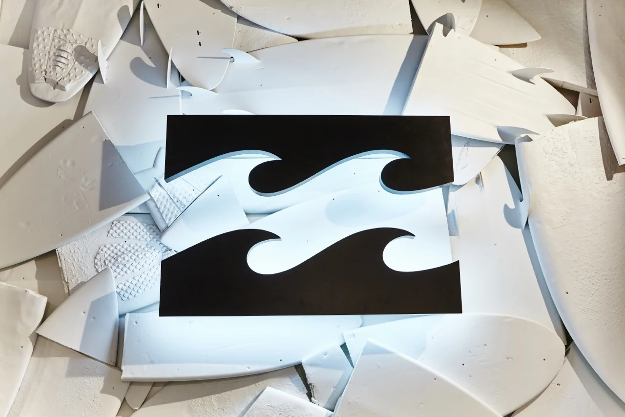
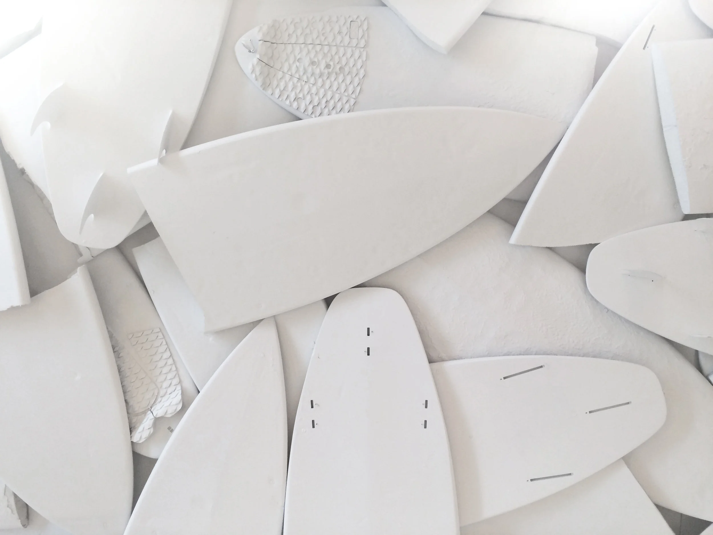
The main feature of this store is the powerful ceiling. We recessed reclaimed surfboards into a ceiling cavity which were randomly placed and finished in a matte white paint. The result is an amazing depth of texture that is relevant to the brand ideology and a real defining feature of the store. The boards wrap down the back wall behind the ‘Point Of Sale’ where they create a textured backdrop for an over sized Billabong logo. This hero sign is an iconic part of the store and a real focal point as customs wander deeper into it.
The brief asked for the stores to be simplified. Balancing the layout and reducing the finishes pallet achieved this. The majority of the walls are finished in white paint or simple textures like brick. This works as a backdrop for the bright merchandise and selected lifestyle graphics as we want to merchandise to tell the story. The interior space feels light and fresh but with some bold statements. The flooring was a rich but simple oak to complement the shop front and selected timber fixtures.
The fitting rooms are an example of adding sophistication to the store design. The simple and clean fitting room areas are textured with white brick and complemented with full height steel and glass doors. The goal was to bring an outdoors feel to these simple spaces and then we softened them with beautiful textured sisal carpets and coastal Pandanus plants.
The store fixtures follow this simple and clean brief. The focus was on textures and limited finishes for both men’s and women’s departments which create a clean backdrop for the bold apparel. Full height alcoves helped confine different products into easily shopped spaces and kept everything clean and identifiable.
It was a privilege to be involved in the design of this store for a world-renowned brand. We have made our mark with the new look for Billabong, turning it into a more sophisticated shopping experience but still keeping the iconic ideology of the brand throughout.
australian geographic
Iconic brand Australian Geographic recently asked aplin creative to lead the creative direction on their rollout of more than 25 stores right across Australia.
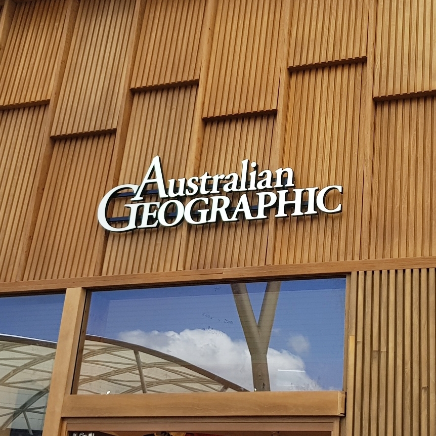
Australian Geographic showcases the natural history and outdoor environment of our beautiful country and tells stories of Australian adventurers all over the world, so aplin creative’s vision was to bring the outdoors into Australian Geographic’s new stores. As such, every store incorporates a very simple fit-out along with materials and finishes from Australia’s natural environment to complement the brand’s natural ideology.
Each store invites the customer to embark on an outback adventure without having to leave the city. The shop front is clad in Spotted Gum, a native Australian timber that’s commonly found in the outback. The Spotted Gum is detailed with gum leaves, and the open shop front showcases large window displays and a timber slat feature that leads into the store’s interior. The same timber slat feature then takes the customer on a journey throughout the store, culminating in a feature canopy and backdrop over and behind the front counter.
Because Australian Geographic revolves around the outdoors, aplin creative wanted to get customers as close to the outdoors as possible – with little effort. A space feature at the back of the store reflects Australia’s expansive night sky, while a tree feature area includes a full-height plywood tree that displays featured product in its branches.
The stores’ flooring incorporates a striking mix of rusty tones mixed with a silvery sheen, inspired by the clays and gum trees of the Australian outback. Simple and functional fixtures and wall fittings are constructed from pine plywood and work as a natural backdrop for the rest of the store. Finally, the counter and feature displays represent shipping crates.
For more information about Australian Geographic, visit their website. To find out how aplin creative could help your store fit-out, contact us now.
billabong melbourne
BILLABONG the world’s largest surf lifestyle brand opened the doors of its new flagship store at the Melbourne Queen Victoria Village. aplin creative was again proud to lead the creative direction of this store and be the designer.
Melbourne QV is uniquely positioned in a well established shopping and entertainment precinct, located in the heart of Melbourne city. The Billabong site is one of the centers premium street front locations. Due to this, we had to take a more considered approach.
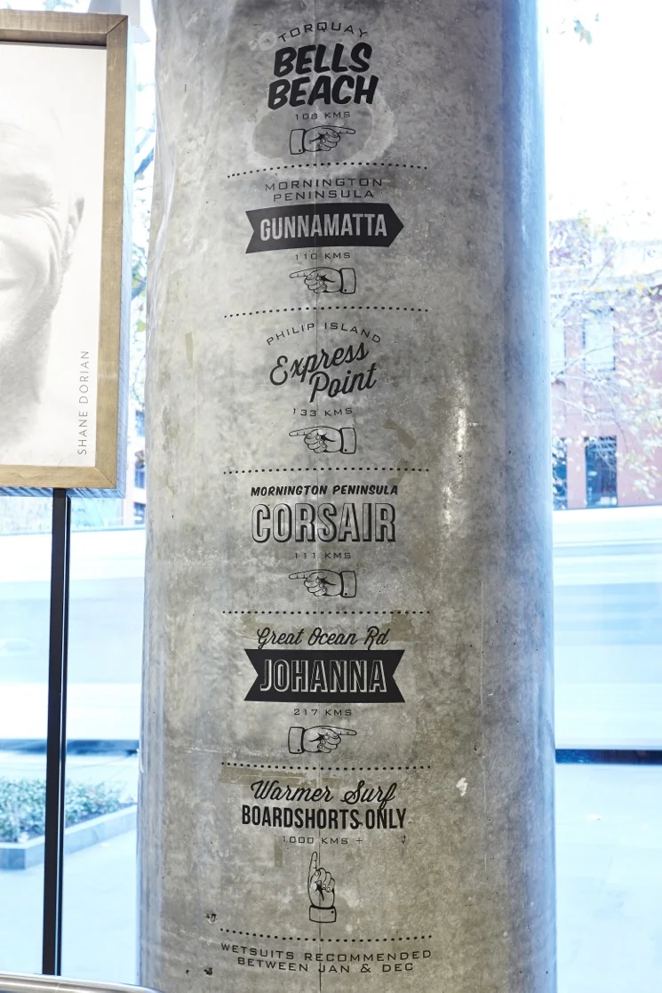
The store needed to be a Billabong flagship but with consideration to the urban culture of Melbourne. We achieved this by using the sites existing architectural elements that reflect the urban environment surrounding it. A good example of this is the large cement walls that we simply finished in a clear liquor to leave the beautiful cement exposed. We also left the structural cement columns within the site exposed. Other great features like the cement floor on the lower levels and the exposed services above the feature ceiling all complement the urban feel that pays respect to Melbourne and the location of this store.
Balancing this urban feel with surf lifestyle is always challenging. With the help of reclaimed timbers for feature walls, fixtures and flooring we created a feeling within the store reflects the brand ideology. We used the now iconic reclaimed surfboard ceiling that wraps down the back wall behind the ‘Point Of Sale’. The boards create a textured backdrop for an oversized Billabong logo, which brings you back to the brands surf origins.
This amazing depth of texture that the feature ceiling creates is a real defining feature of the store. The ceiling leads you to the fitting rooms that are simple and clean. The fitting room areas are textured with white brick and complemented with steel and glass doors. The goal was to bring an outdoors feel to these simple spaces. We then softened them with beautiful textured sisal carpets and coastal Pandanus plants.
The existing mall facade was retained in this store. So to incorporate the iconic Billabong shop front we built an entry portal inside the store. As you enter the store the iconic black timber extends back into the store to make a threshold or band of solid black. Slate flooring complements and adds contrast to this timber portal. We used beautiful oak lining boards with black stain to achieve this bold entry. The finish of this timber has a strong visible grain and texture but is very clean at the same time. The shop front signage has black on black branding which is a confident, clean and bold statement for Billabong. Digital media and a basic but well merchandised window display complete this striking entry.
This store is the biggest and best so far for Billabong and the Melbourne QV Shopping centre agree with this, awarding the ‘QV Melbourne Retail Excellence Award 2015 Fitout Of The Year’. aplin creative are proud to receive such praise from the team at Melbourne QV and It was a privilege to be involved in the design of another store for this world renowned brand.
SEE MORE
zeus street greek
When you think ‘kebab’, you often imagine late-night hangover cures rather than healthy, flavoursome meals. Zeus Street Greek is reinventing the perception of classic Greek cuisine with its rollout of new restaurants right across Australia. Traditional Greek street food is combined with the best local produce and set in a relaxed, contemporary environment to create fresh, healthy, casual dining that’s delicious any time of the day.
aplin creative worked with hospitality experts DS17 and the Zeus team to help deliver the look and tone for the brand, along with documenting the fit out of each restaurant. While every site is different, they all have the same Zeus DNA: a love of eating great food with great people. Simple lines, exposed brick, reclaimed timbers, distressed cement and wooden tables give each restaurant that modern industrial feel while bringing the outdoors in. Bold and mismatched patterns like chevron and spots complement stylish white subway titles and black finishings to add a touch of finesse to each restaurant.
Zeus restaurants are currently expanding right across Australia. Visit www.zeusstreetgreek.com.au to find out more.
billabong south-east asia & the middle east
The iconic Australian brand, Billabong, is already one of the largest surf and lifestyle brands on earth, but they’re taking one giant leap toward total world domination with the rollout of more than 10 stores throughout South-East Asia and the Middle East, including Indonesia, Singapore, Oman, Dubai, Thailand and Saudi Arabia. After being commissioned to rebrand other Billabong stores throughout Australia, aplin creative is proud to be leading the stores’ creative direction in these new markets too.
Renowned for their surf, swim and street wear and accessories, along with a traditionally casual tone and ideology, Billabong wanted to create a simple yet strong and sophisticated retail design in their new stores in order to appeal to a broader customer base.
First impressions count, therefor aplin creative chose to keep Billabong’s recognisable black timber entrance. However, we have created a more sophisticated look by using beautiful oak lining boards with black staining, extending it back into the store and complementing it with slate flooring. Sophistication was on the agenda for the storefront branding too, with black nickel metal lettering and strong back lighting. The black on black effect creates a confident, clean and bold statement. Digital media and a basic, but well-merchandised window display completes this simple yet striking store entranceway.
Billabong was built around surfing and the outdoors, so when customers step inside the Billabong store they’re immediately met with a powerful ceiling that harks back to the brand’s inherent ideology. aplin creative randomly placed reclaimed surfboards into a ceiling cavity and painted them matte white which creates an amazing depth of texture and reminds customers of the brand’s origins. The boards wrap down the back wall behind the front counter, and an oversized Billabong logo creates a impressive focal point within the store.
When it comes to interior finishes, the brief was to allow the bright merchandise and lifestyle graphics to tell Billabong’s story rather than relying on the shop itself. Most walls are finished in white paint or simple textures like brick, so the interior space feels light and fresh. The flooring is a rich but simple oak that complements the shop front and other timber fixtures inside.
To create a sophisticated retail experience, the fitting room area is textured with white brick and is complemented with full-height steel and glass doors. An open outdoor feel that supports Billabong’s ideology is achieved by beautiful textured sisal carpets and coastal Pandanus plants scattered amongst the fitting room area.
Billabong’s fixtures maintain this simple and clean brief too. Textures and limited finishes in both men’s and women’s departments create a clean backdrop for Billabong’s bold apparel. Full-height alcoves help customers effortlessly find what they’re looking for, and ensure all products on display are clean and identifiable.
For more information about Billabong, visit their website. To find out how aplin creative could help your store fit-out, contact us now.
elka collective
After redesigning their flagship store on Melbourne’s Chapel Street, Elka Collective commissioned aplin creative to design their second boutique too, this time in an old terrace building in Brighton.
Elka’s signature style and muted earthy tones, reflected in both their high-end fashionwear and their Windsor store, continues throughout their new concept space. The old building originally featured a series of individual rooms which aplin opened up to create an airy showroom in which to display both Elka’s wares and a carefully-curated selection of lifestyle brands. Rich timber floors, brick and lime-rendered walls, and stone cabinetry create a natural yet luxurious design palate, while Windsor’s European-inspired curved walls and arched doors make an appearance here too. Timber-lined walls add a sense of opulent luxury to the changing booths while sleek yet simple clothing rails and exterior signage add subtle minimalism to the overall design.
You can visit Elka Collective’s new store at 68 Church Street, Brighton.
PHOTOS: Danielle Castano
2020 Finalist in BEST AWARDS
billabong melbourne
BILLABONG the world’s largest surf lifestyle brand opened the doors of its new flagship store at the Melbourne Queen Victoria Village. aplin creative was again proud to lead the creative direction of this store and be the designer.
Melbourne QV is uniquely positioned in a well established shopping and entertainment precinct, located in the heart of Melbourne city. The Billabong site is one of the centers premium street front locations. Due to this, we had to take a more considered approach.
The store needed to be a Billabong flagship but with consideration to the urban culture of Melbourne. We achieved this by using the sites existing architectural elements that reflect the urban environment surrounding it. A good example of this is the large cement walls that we simply finished in a clear liquor to leave the beautiful cement exposed. We also left the structural cement columns within the site exposed. Other great features like the cement floor on the lower levels and the exposed services above the feature ceiling all complement the urban feel that pays respect to Melbourne and the location of this store.
Balancing this urban feel with surf lifestyle is always challenging. With the help of reclaimed timbers for feature walls, fixtures and flooring we created a feeling within the store reflects the brand ideology. We used the now iconic reclaimed surfboard ceiling that wraps down the back wall behind the ‘Point Of Sale’. The boards create a textured backdrop for an oversized Billabong logo, which brings you back to the brands surf origins.
This amazing depth of texture that the feature ceiling creates is a real defining feature of the store. The ceiling leads you to the fitting rooms that are simple and clean. The fitting room areas are textured with white brick and complemented with steel and glass doors. The goal was to bring an outdoors feel to these simple spaces. We then softened them with beautiful textured sisal carpets and coastal Pandanus plants.
The existing mall facade was retained in this store. So to incorporate the iconic Billabong shop front we built an entry portal inside the store. As you enter the store the iconic black timber extends back into the store to make a threshold or band of solid black. Slate flooring complements and adds contrast to this timber portal. We used beautiful oak lining boards with black stain to achieve this bold entry. The finish of this timber has a strong visible grain and texture but is very clean at the same time. The shop front signage has black on black branding which is a confident, clean and bold statement for Billabong. Digital media and a basic but well merchandised window display complete this striking entry.
This store is the biggest and best so far for Billabong and the Melbourne QV Shopping centre agree with this, awarding the ‘QV Melbourne Retail Excellence Award 2015 Fitout Of The Year’. aplin creative are proud to receive such praise from the team at Melbourne QV and It was a privilege to be involved in the design of another store for this world renowned brand.
SEE MORE


