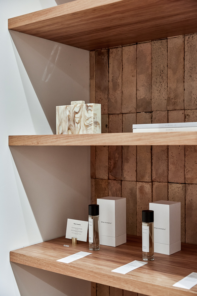
Elka Collective Fortitude Valley feature in est alongside the best of Brisbane Retail. See more HERE
Elka Collective Wins Best Award
The Elka Collective store designed by aplin creative wins Bronze at the Best awards. See more here: bestawards.co.nz
Elka Collective’s Second Concept Space
After redesigning their flagship store on Melbourne’s Chapel Street, Elka Collective commissioned aplin creative to design their second boutique too, this time in an old terrace building in Brighton.
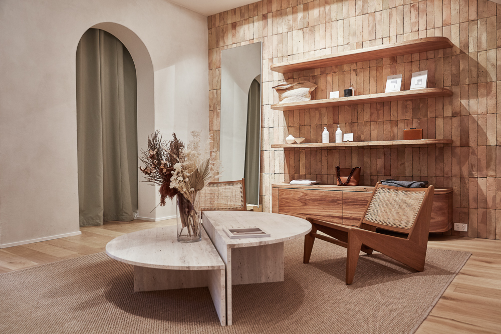
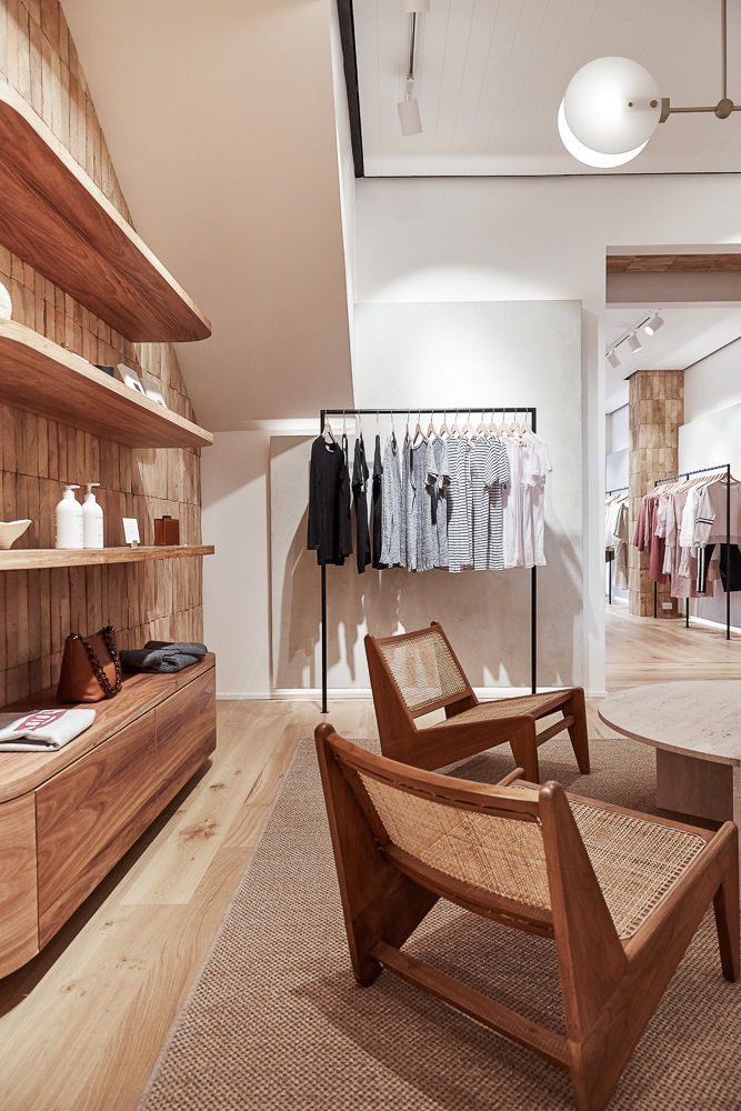
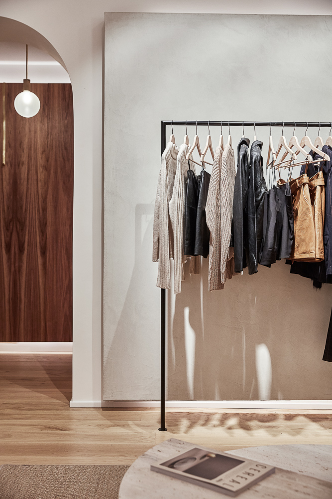
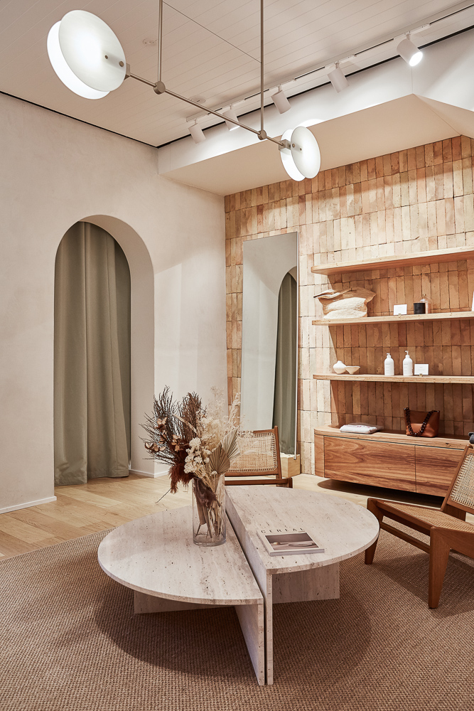
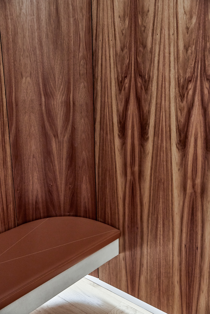
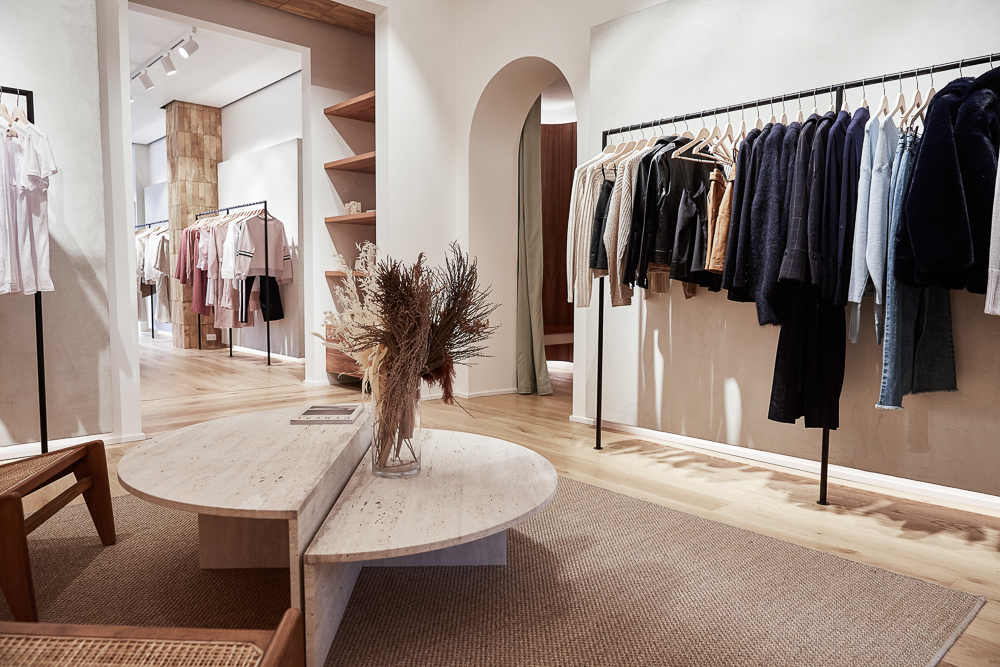
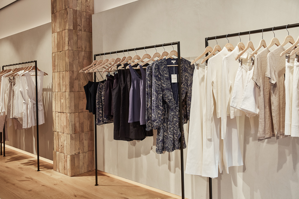
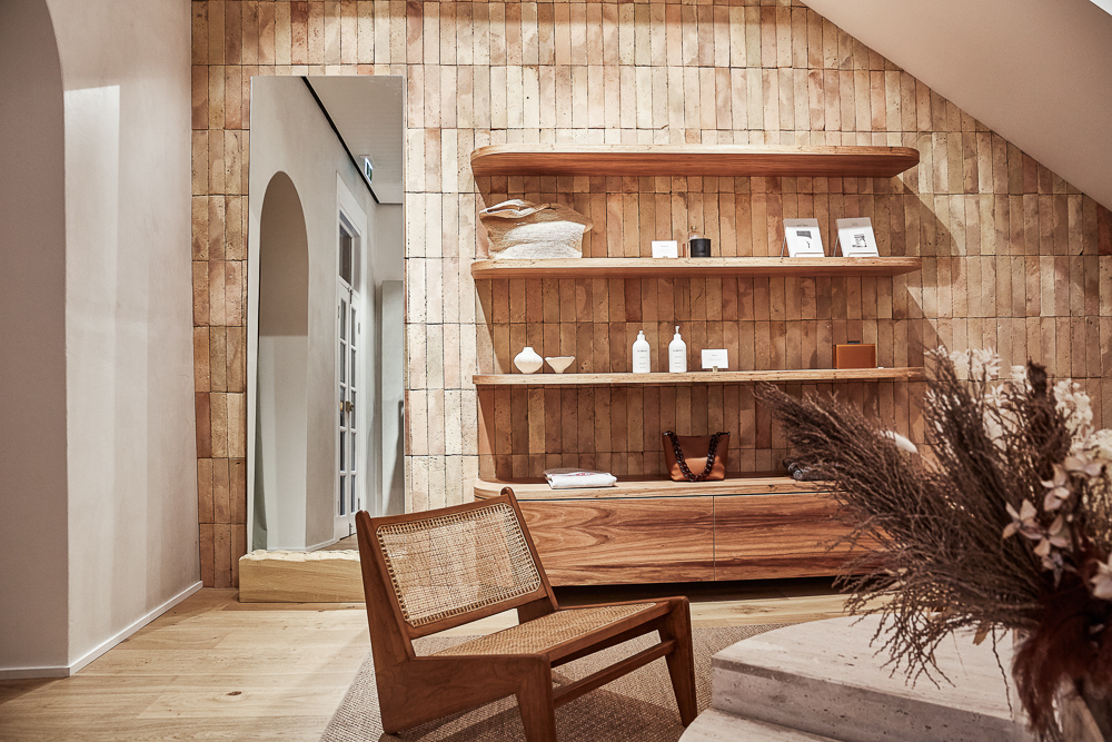
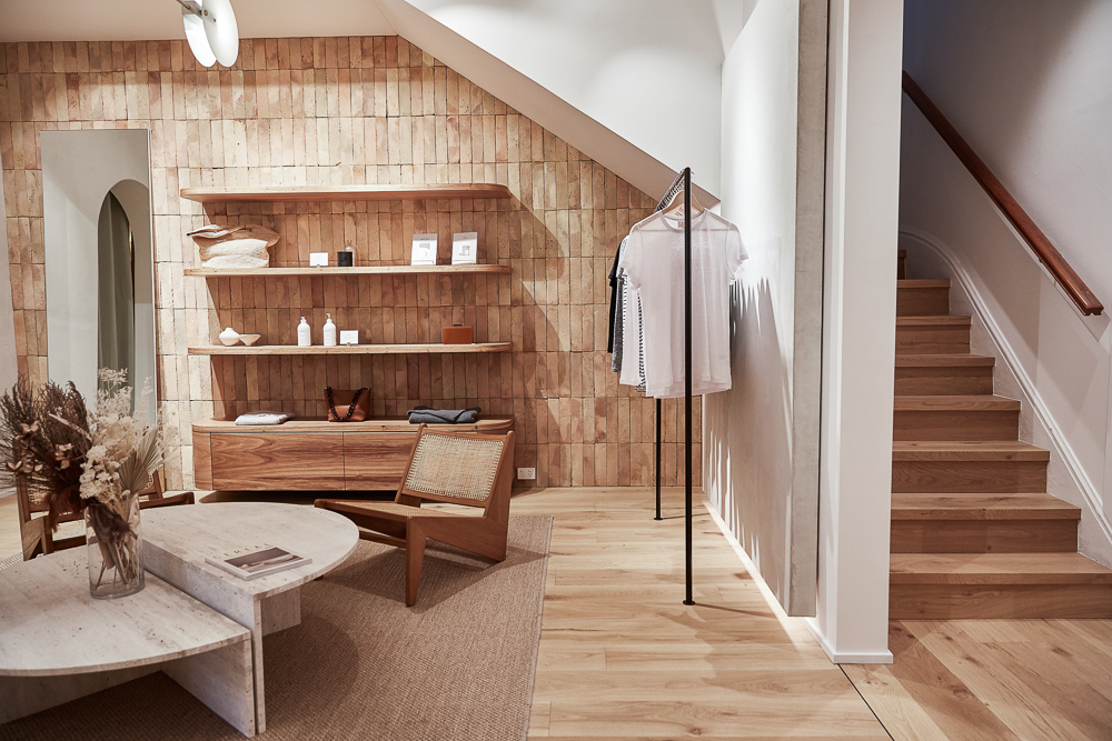
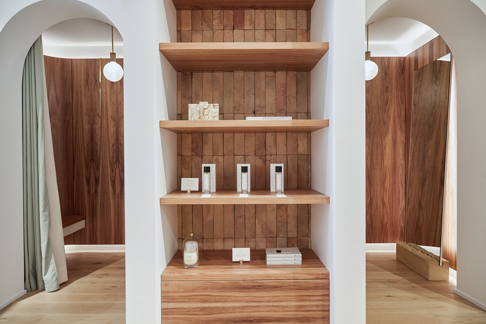
Elka’s signature style and muted earthy tones, reflected in both their high-end fashionwear and their Windsor store, continues throughout their new concept space. The old building originally featured a series of individual rooms which aplin opened up to create an airy showroom in which to display both Elka’s wares and a carefully-curated selection of lifestyle brands. Rich timber floors, brick and lime-rendered walls, and stone cabinetry create a natural yet luxurious design palate, while Windsor’s European-inspired curved walls and arched doors make an appearance here too. Timber-lined walls add a sense of opulent luxury to the changing booths while sleek yet simple clothing rails and exterior signage add subtle minimalism to the overall design.
You can visit Elka Collective’s new store at 68 Church Street, Brighton.
PHOTOS: Danielle Castano




elka collective
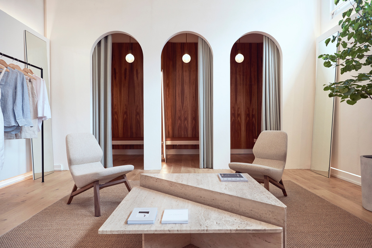
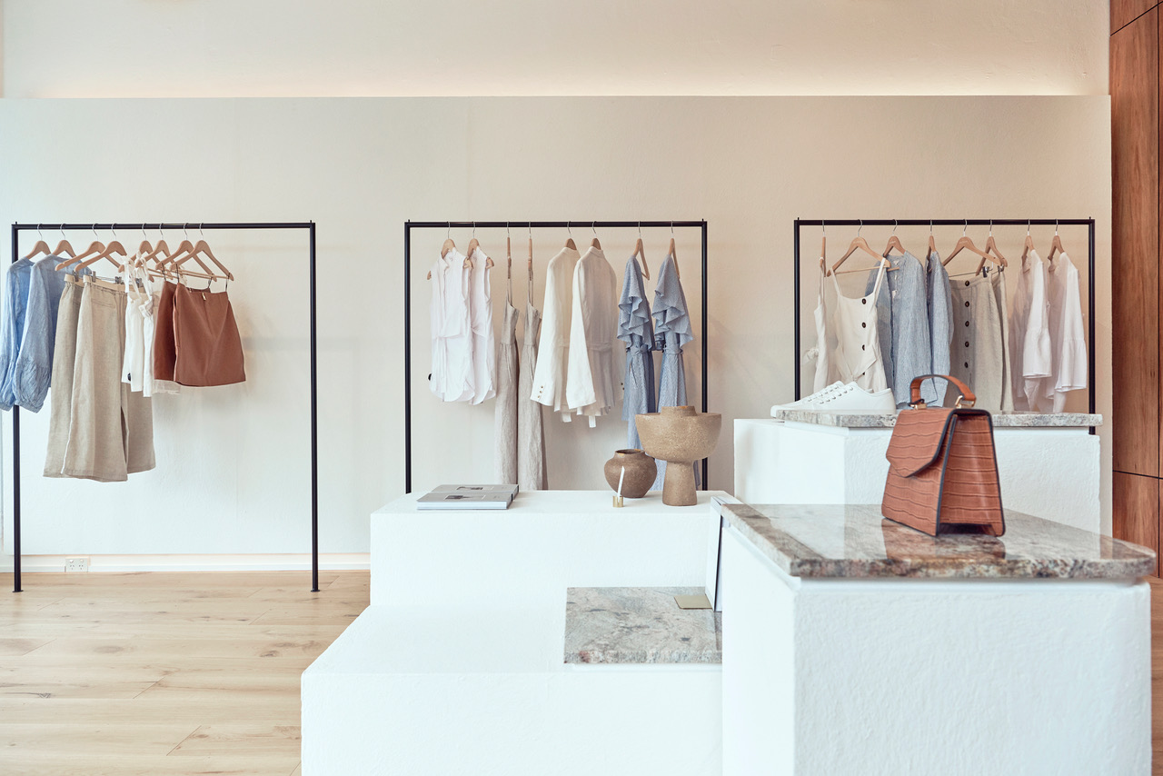
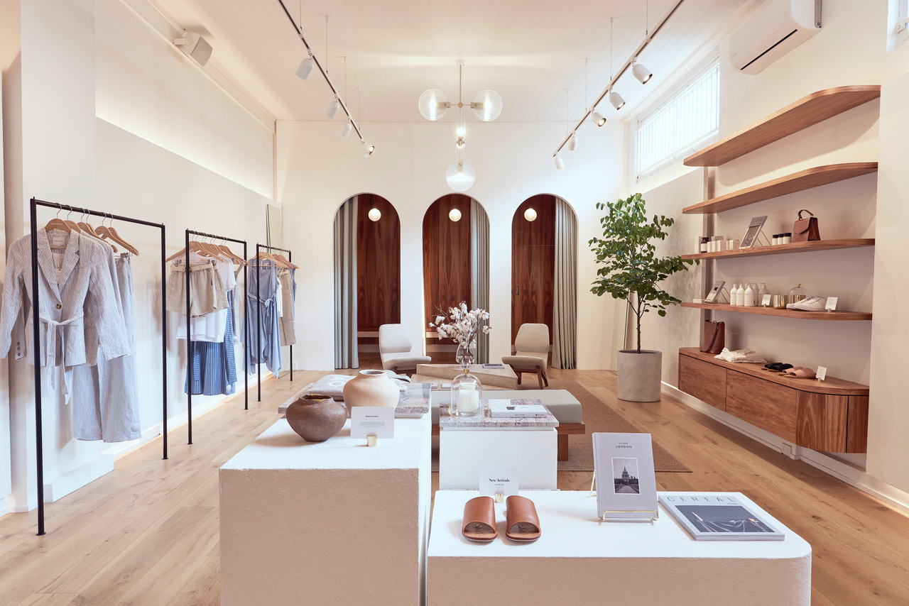
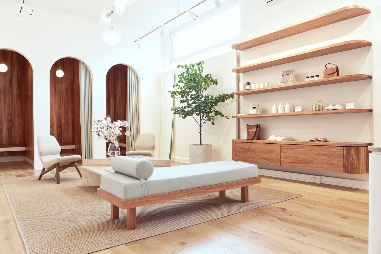
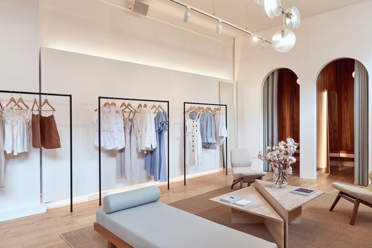
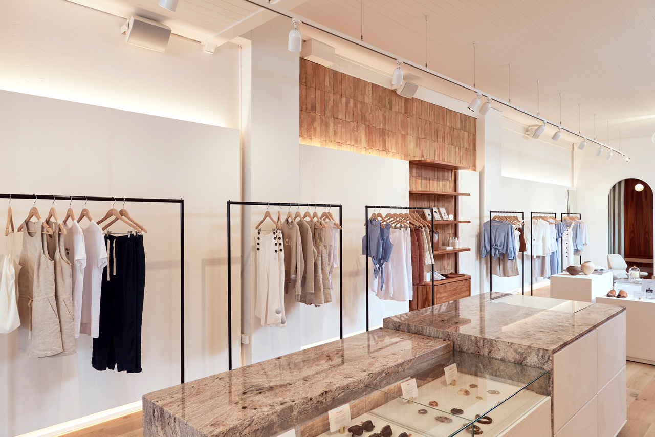
Taking inspiration directly from Elka Collective we began a design journey with the desire to complement the beautifully crafted and carefully-curated brand.
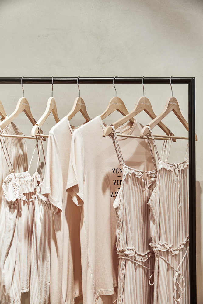
Our design process helped us to create a store that lives and breathes natural tones and textures with a high-end, minimalistic flavour. In the same way the label layers textures and finishes together in their garments, we blended natural marble, sandstone, lime render and rich timbers to create an earthy canvas with a unique European twist.
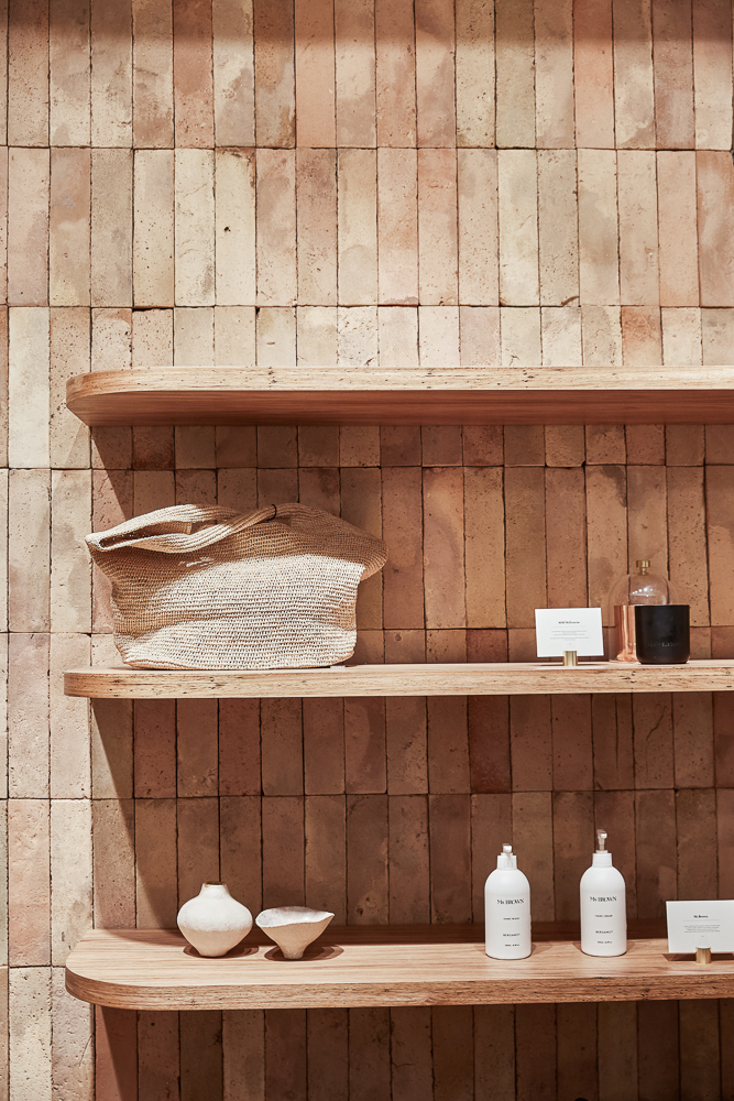
We selected luxurious natural materials that, like the Elka clothing line, are delicate yet timeless. Terracotta tiles reclaimed from the roofs of abandoned historic buildings in Eastern Europe add authenticity to the fitout. Seamless detailing creates a sophisticated and minimalistic space, while the considered selection of natural materials and artisan application add a human touch to the beautifully-constructed space.
When it comes to the final touches, no detail has been spared. A carefully-curated range of local designers complements Elka Collective’s ‘homegrown’ ideology. Attalos pendant lights created by local industrial designer Coco Reynold are used throughout the space, while Ross Gardam’s Melbourne-made Nebulae chandelier hangs pride of place in the centre of the store.
maths words not squiggles

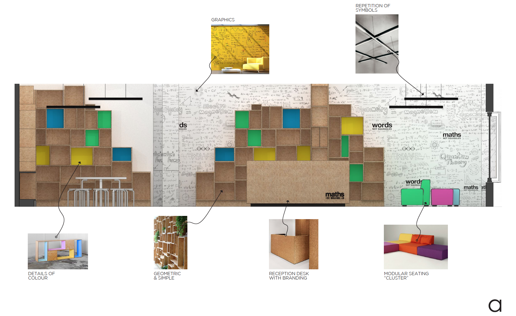


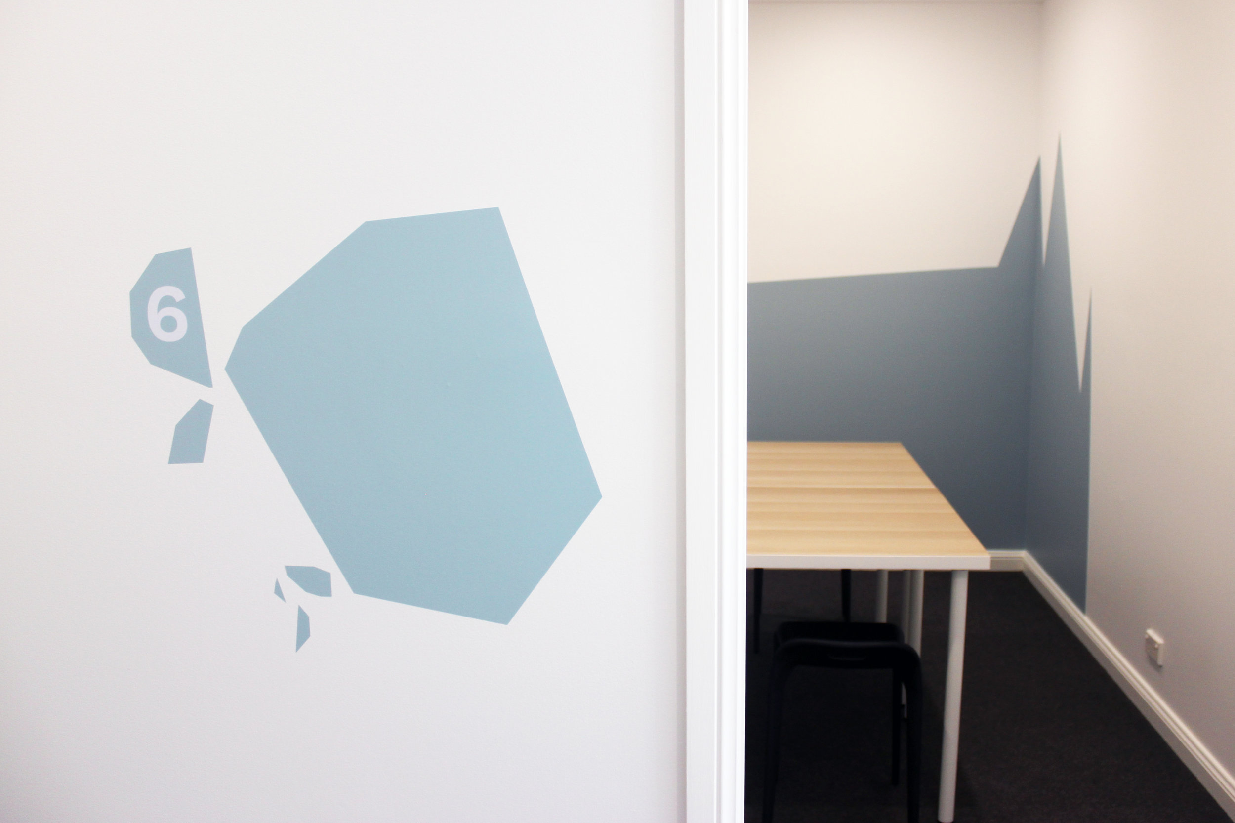
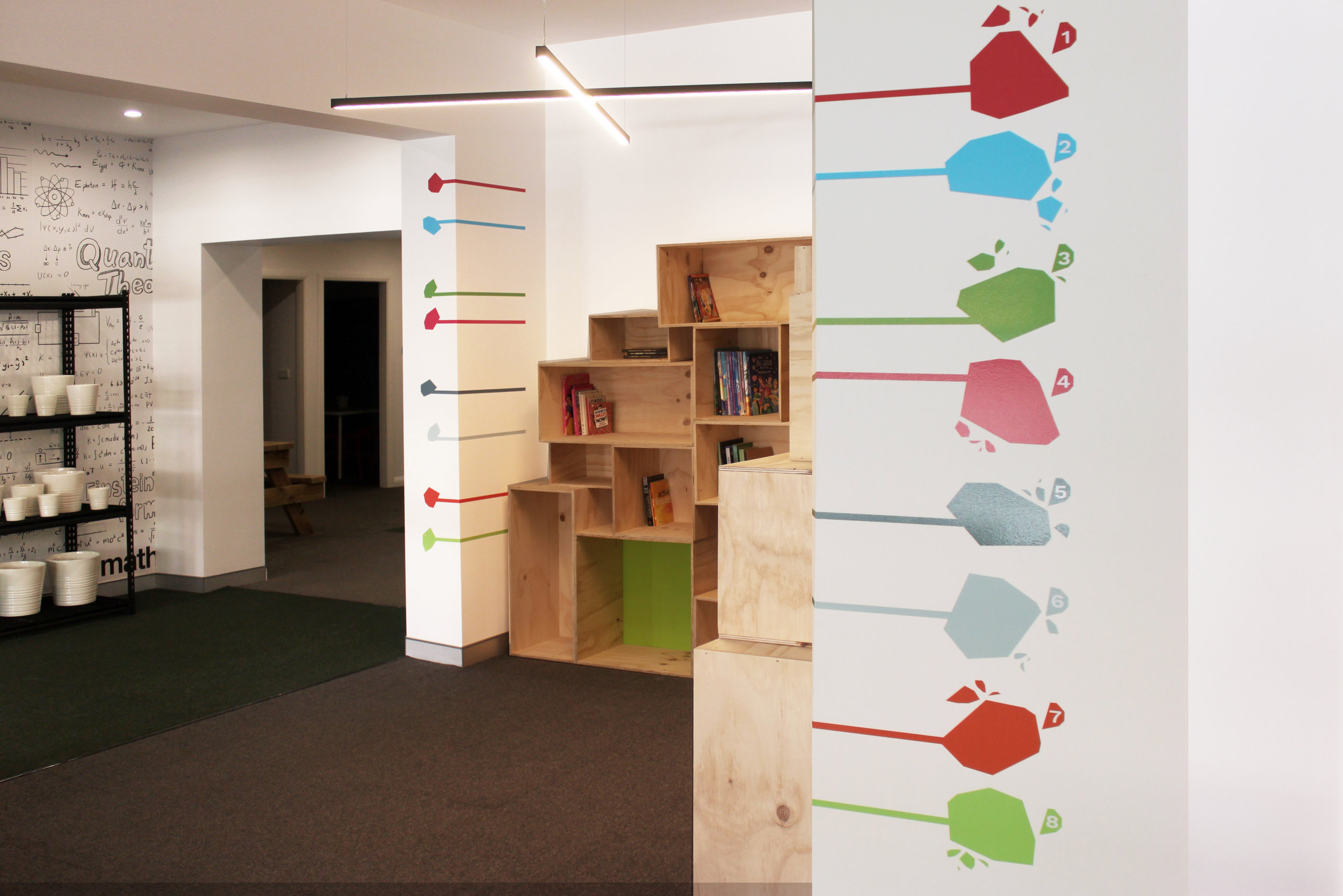
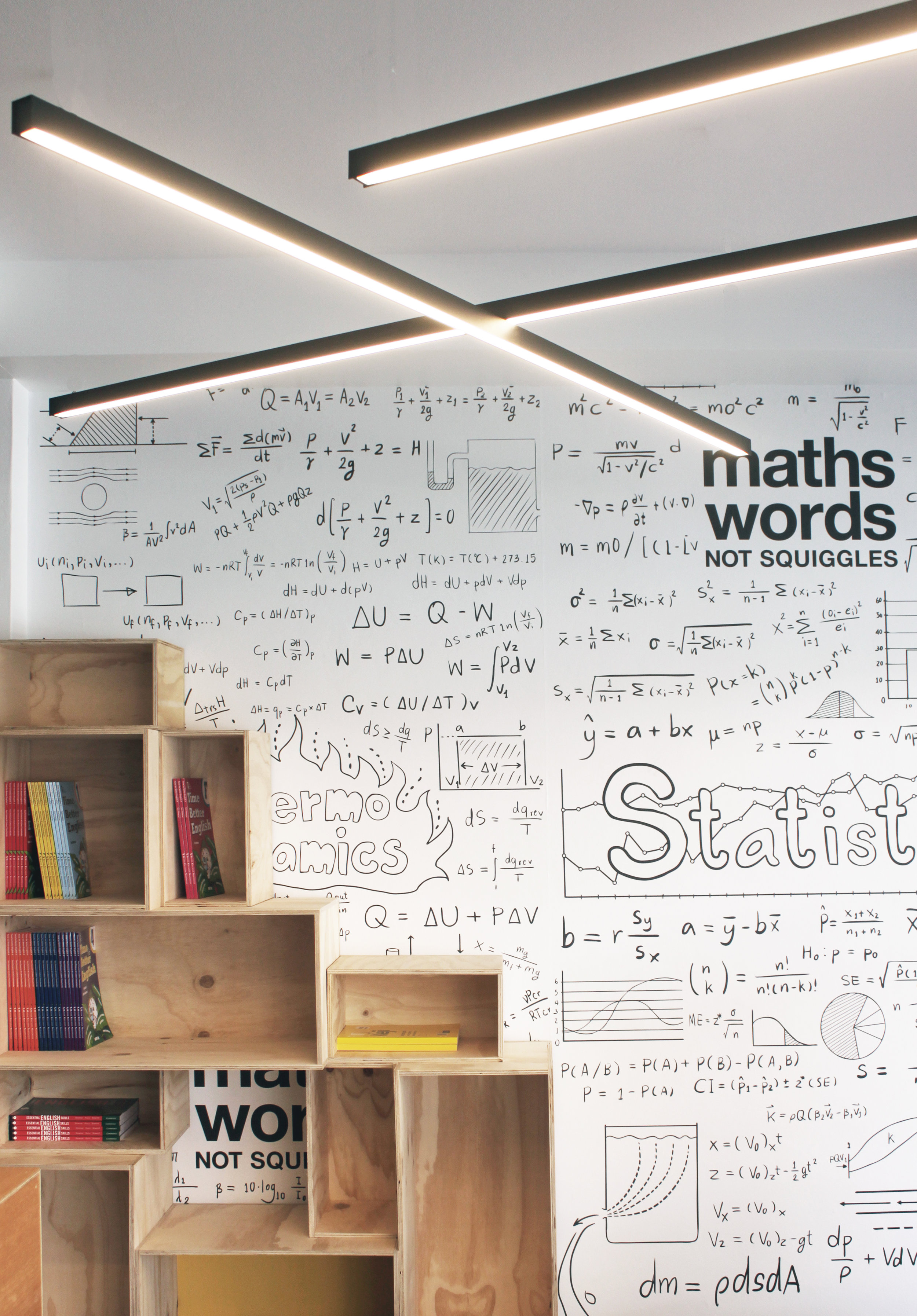
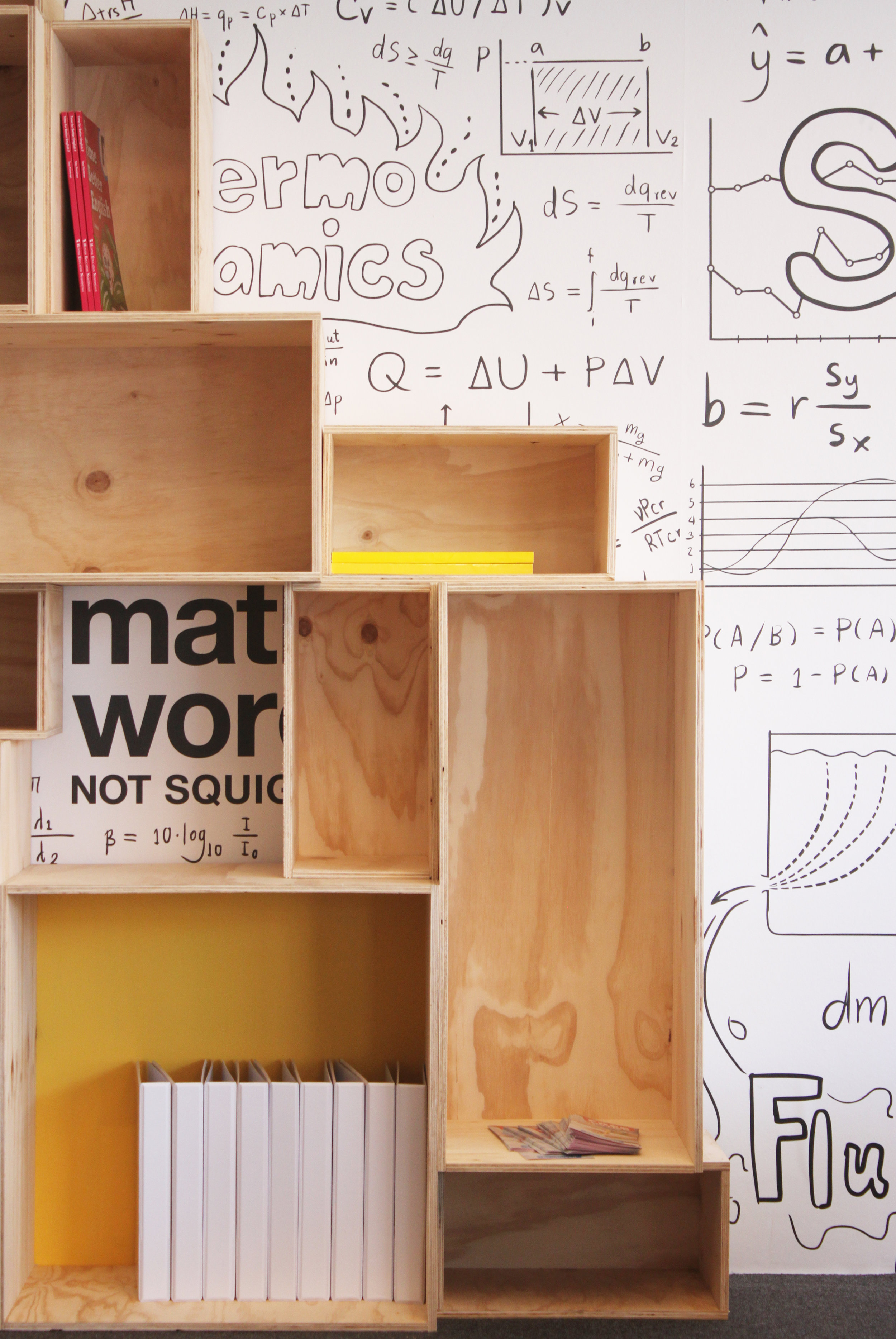
When kids need after-school education, the last thing they want to do is feel like they’re still in class. Maths Words Not Squiggles takes the ‘boring’ out of tutoring and makes it fun and personalised for all levels of primary and secondary education. Lessons aren’t mass-produced, students are treated like individuals and learning is tailored to suit.
aplin creative and Maths Words Not Squiggles worked together to create a fun learning environment that stimulates creativity while encouraging study. Interactive spaces are brought to life using vibrant colours like Golden Marguerite S15H8 and Wicked Green S21H7, while unique wallpaper and graphic navigation instantly engages students. Ply boxes and picnic tables add a casual and relaxed feel to the learning centre – exactly opposite to the typical classroom experience.
Maths Words Not Squiggles learning centres are currently being rolled out across Sydney. Visit www.mwns.com.au to find out more.
LIGHT by aplin creative Editorial Photos
Photography by Sian Egginton, Styling by Fiona Michelon.
SIAN EGGINTON
sianeggintonphoto@gmail.com
FIONA MICHELON
hello@fionamichelon.com
Thanks to spence and lyda cafe culture insitu Armadillo & Co in bed store The DEA Store
Australian Geographic 2017 - 2018 Roll-Out
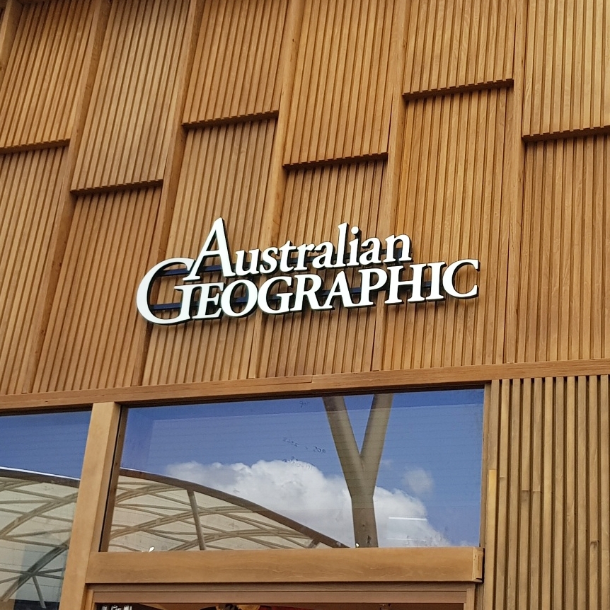
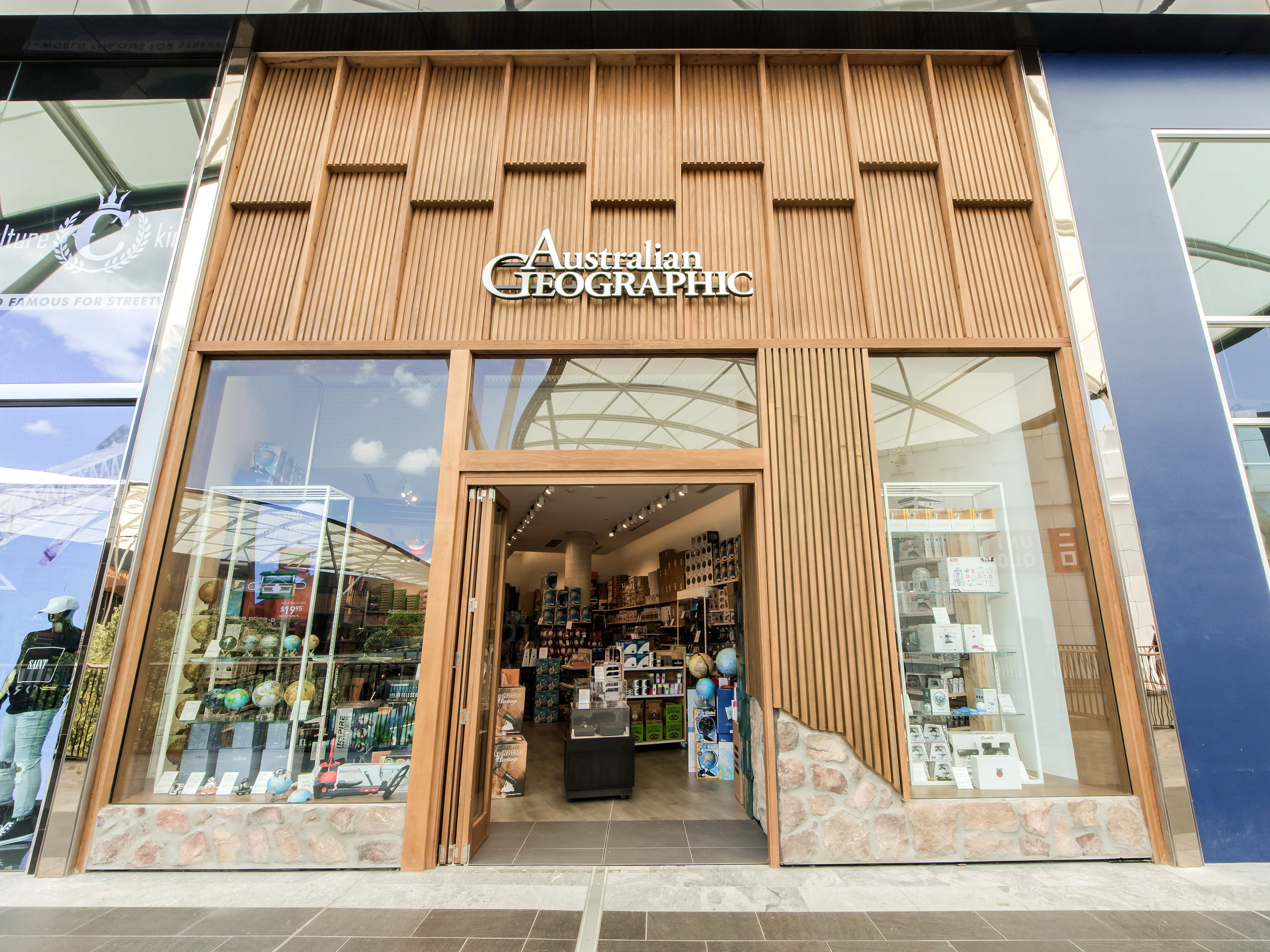
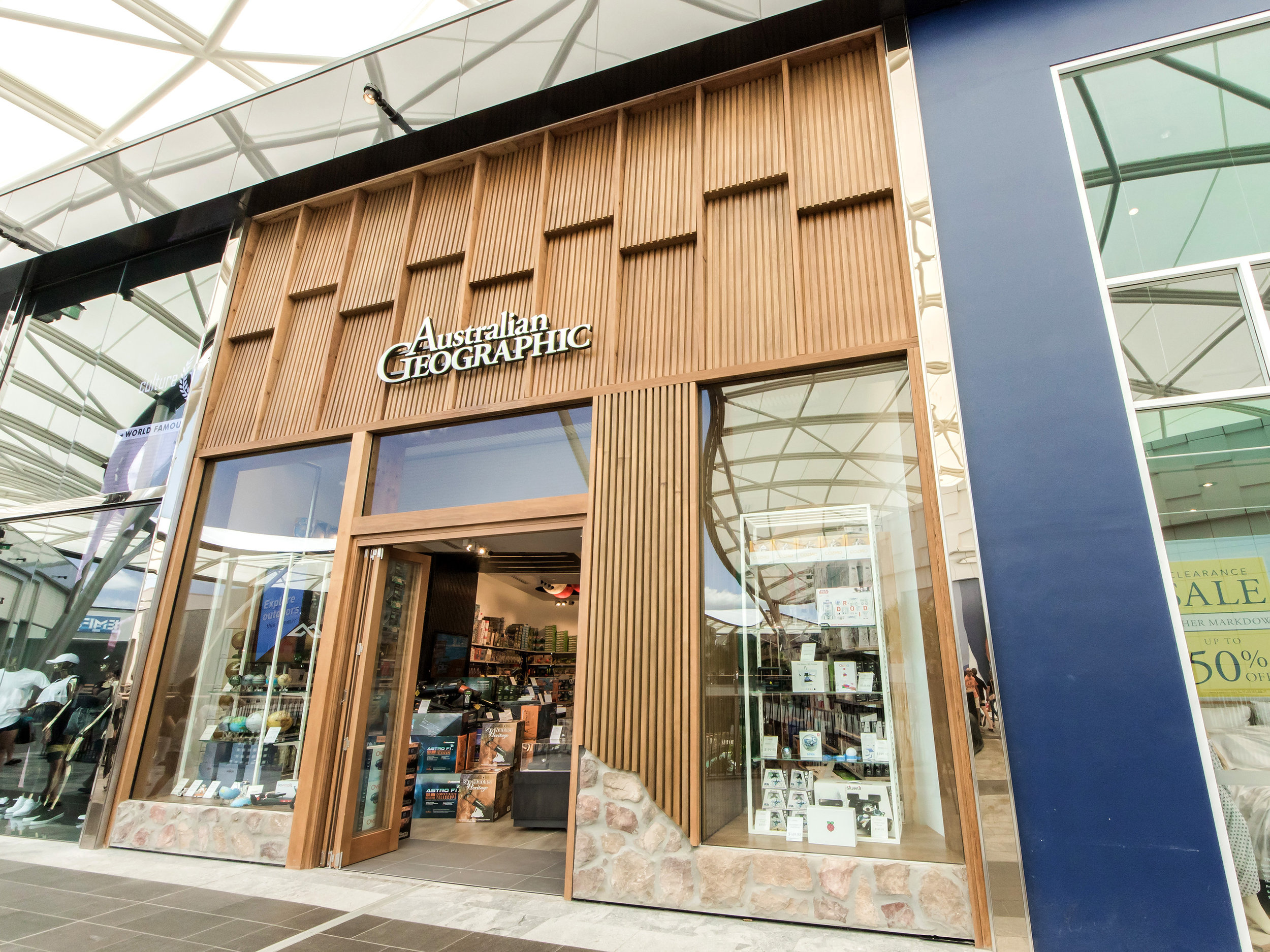
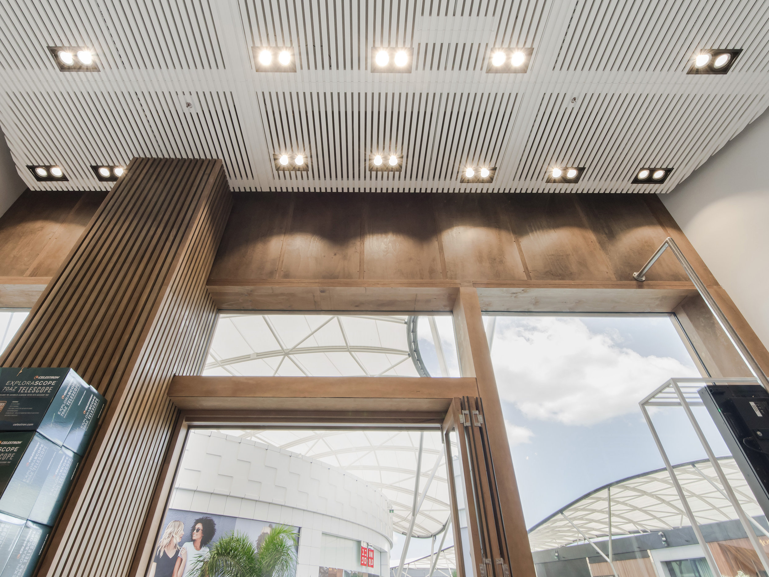
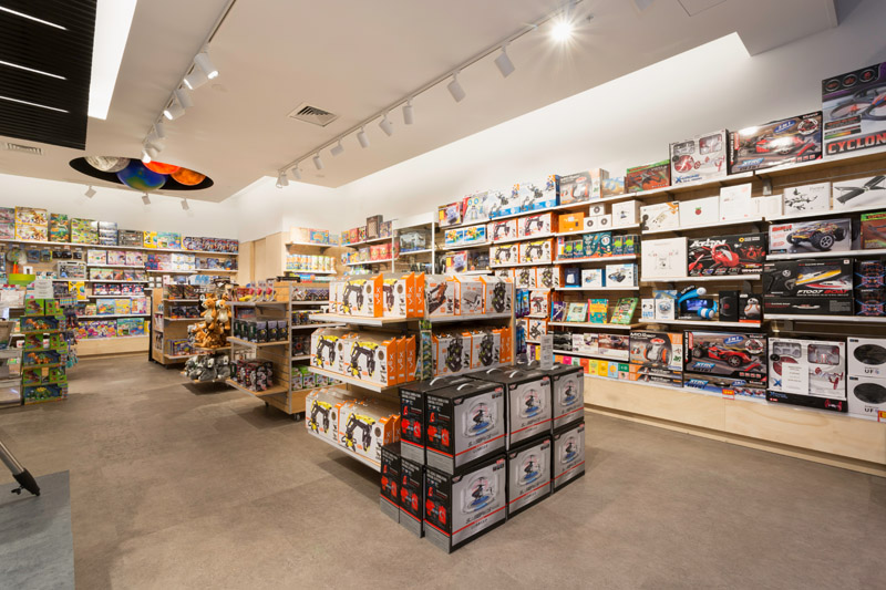
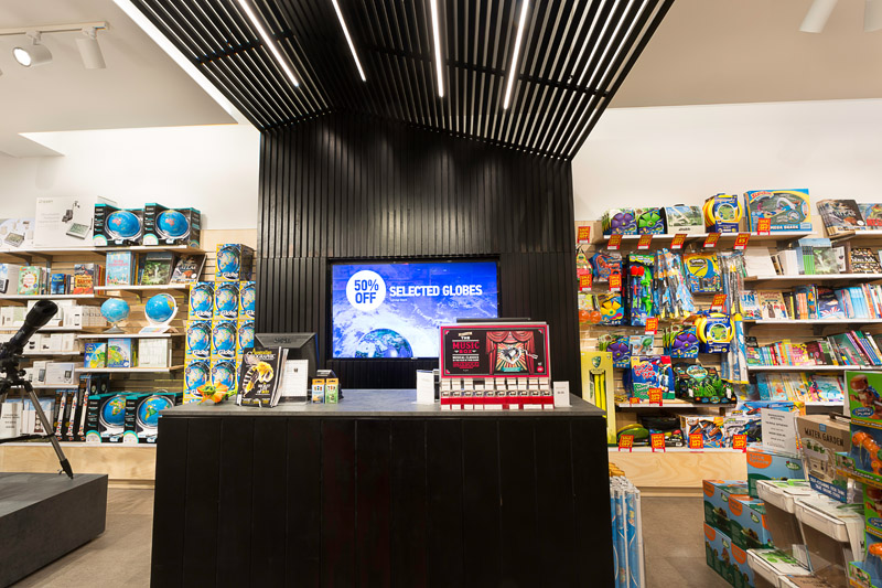
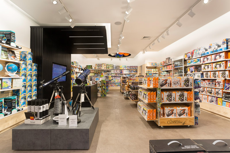

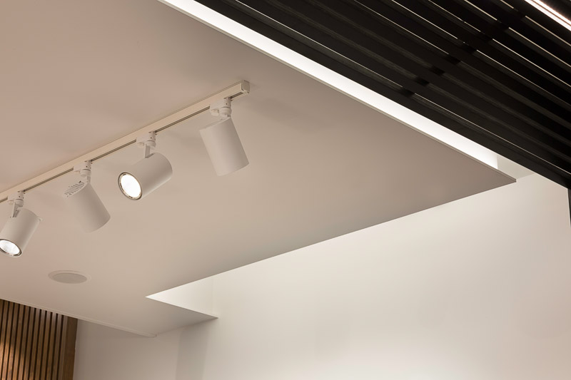
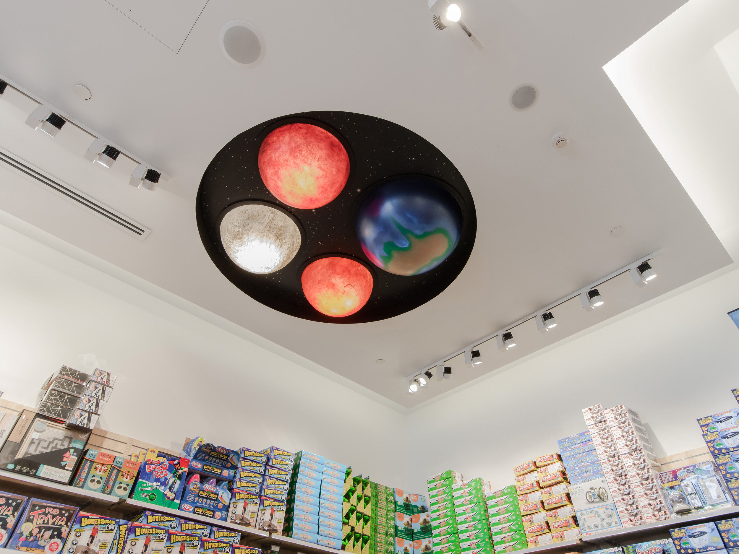
Iconic brand Australian Geographic recently asked aplin creative to lead the creative direction on their rollout of more than 40 stores right across Australia.
Australian Geographic showcases the natural history and outdoor environment of our beautiful country and tells stories of Australian adventurers all over the world, so aplin creative’s vision was to bring the outdoors into Australian Geographic’s new stores. As such, every store incorporates a very simple fit-out along with materials and finishes from Australia’s natural environment to complement the brand’s natural ideology.
Each store invites the customer to embark on an outback adventure without having to leave the city. The shop front is clad in Spotted Gum, a native Australian timber that’s commonly found in the outback. The Spotted Gum is detailed with gum leaves, and the open shop front showcases large window displays and a timber slat feature that leads into the store’s interior. The same timber slat feature then takes the customer on a journey throughout the store, culminating in a feature canopy and backdrop over and behind the front counter.
Because Australian Geographic revolves around the outdoors, aplin creative wanted to get customers as close to the outdoors as possible – with little effort. A space feature at the back of the store reflects Australia’s expansive night sky, while a tree feature area includes a full-height plywood tree that displays featured product in its branches.
The stores’ flooring incorporates a striking mix of rusty tones mixed with a silvery sheen, inspired by the clays and gum trees of the Australian outback. Simple and functional fixtures and wall fittings are constructed from pine plywood and work as a natural backdrop for the rest of the store. Finally, the counter and feature displays represent shipping crates.
For more information about Australian Geographic, visit their website. To find out how aplin creative could help your store fit-out, contact us now.
URBAN BEAUTY westfield warringah mall
URBAN BEAUTY
When Urban Beauty, a beauty salon at Westfield Warringah Mall in Brookvale, Sydney decided to undergo their own makeover, they came to aplin creative.
The brief was to create a clean and modern space that seemed lofty and inviting, including two treatment rooms and a tanning room. The problem? The space was very small – just 38m2 – which left minimal space for a reception area and access between each room, so we designed multiple configurations before settling on one that was functional yet aesthetically pleasing.
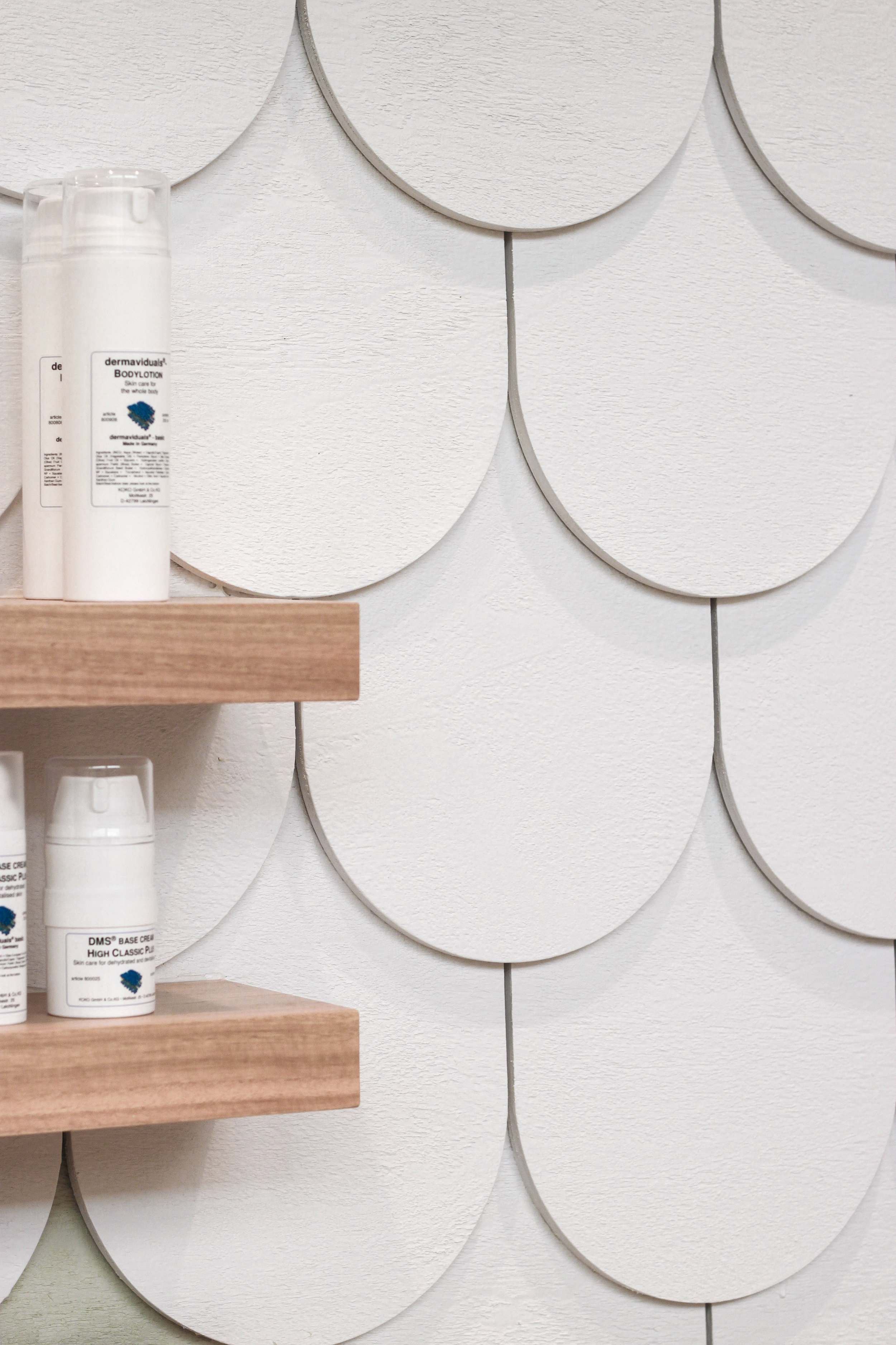
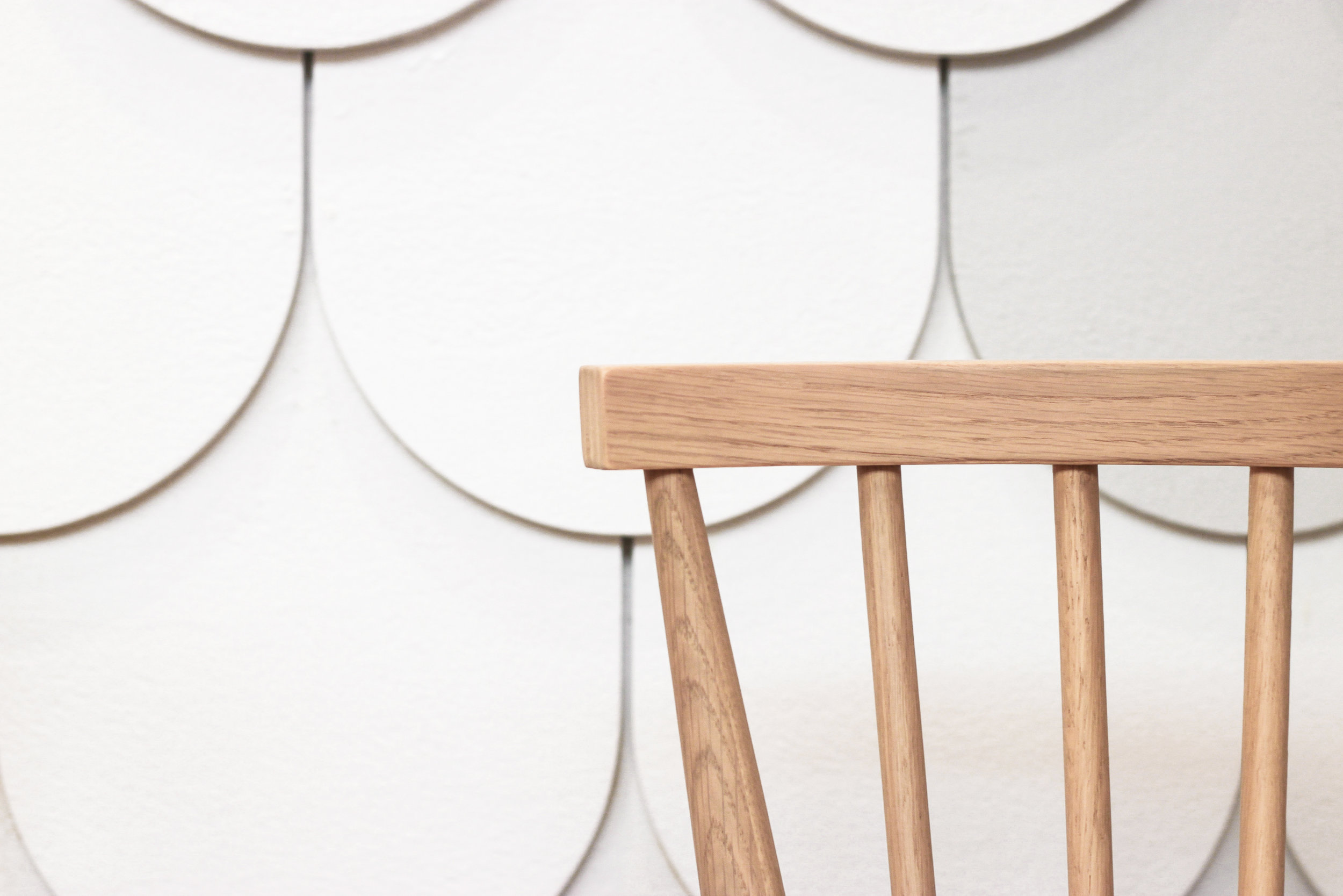
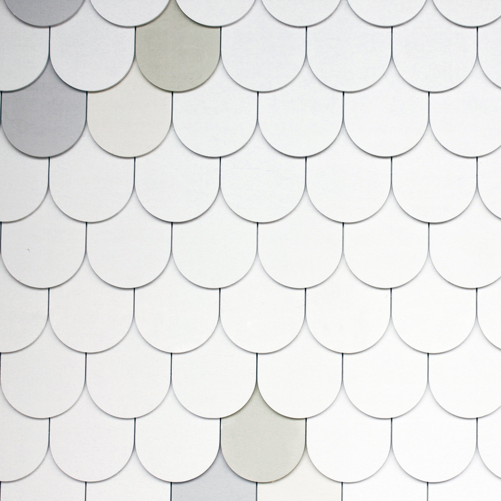
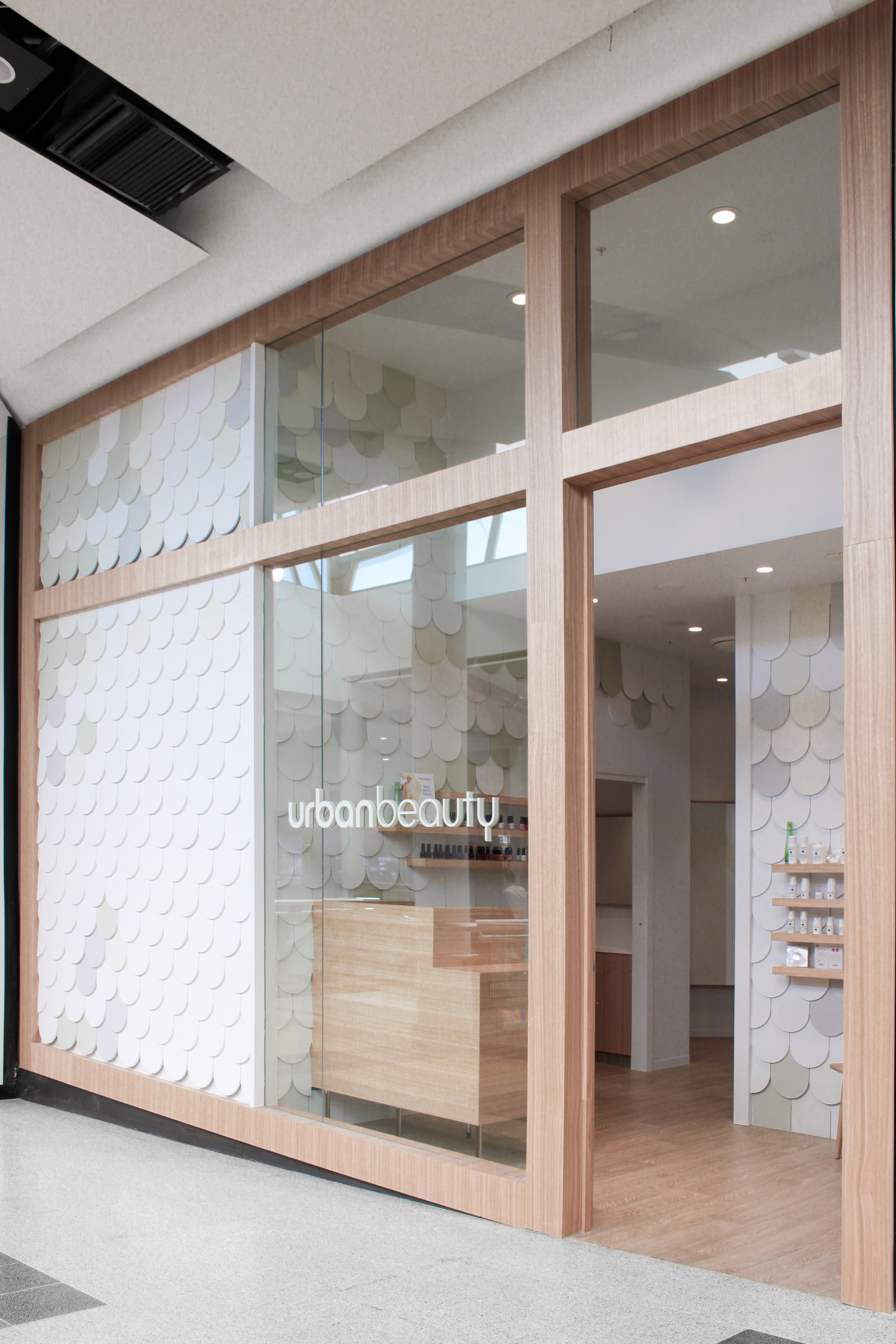
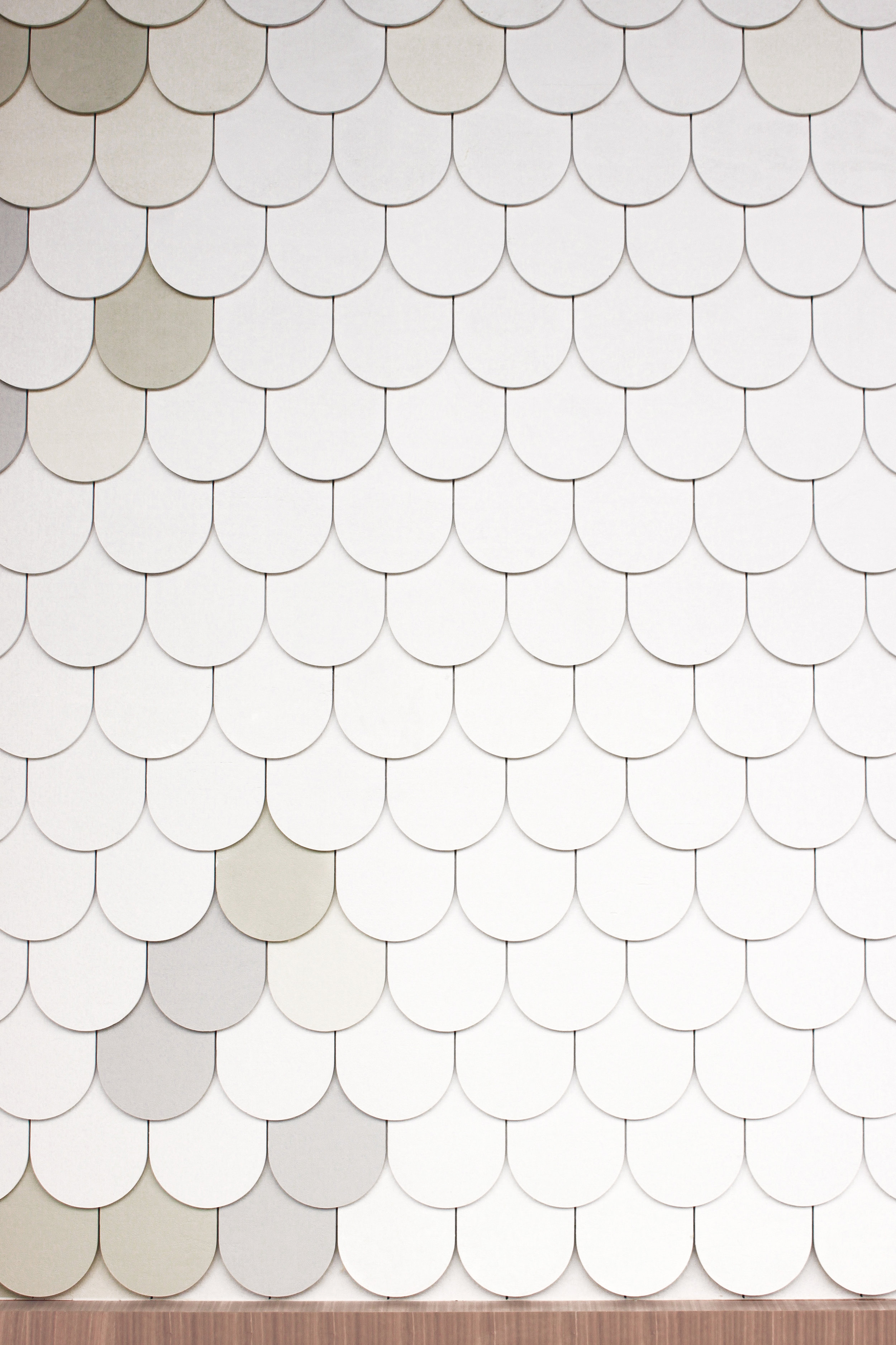
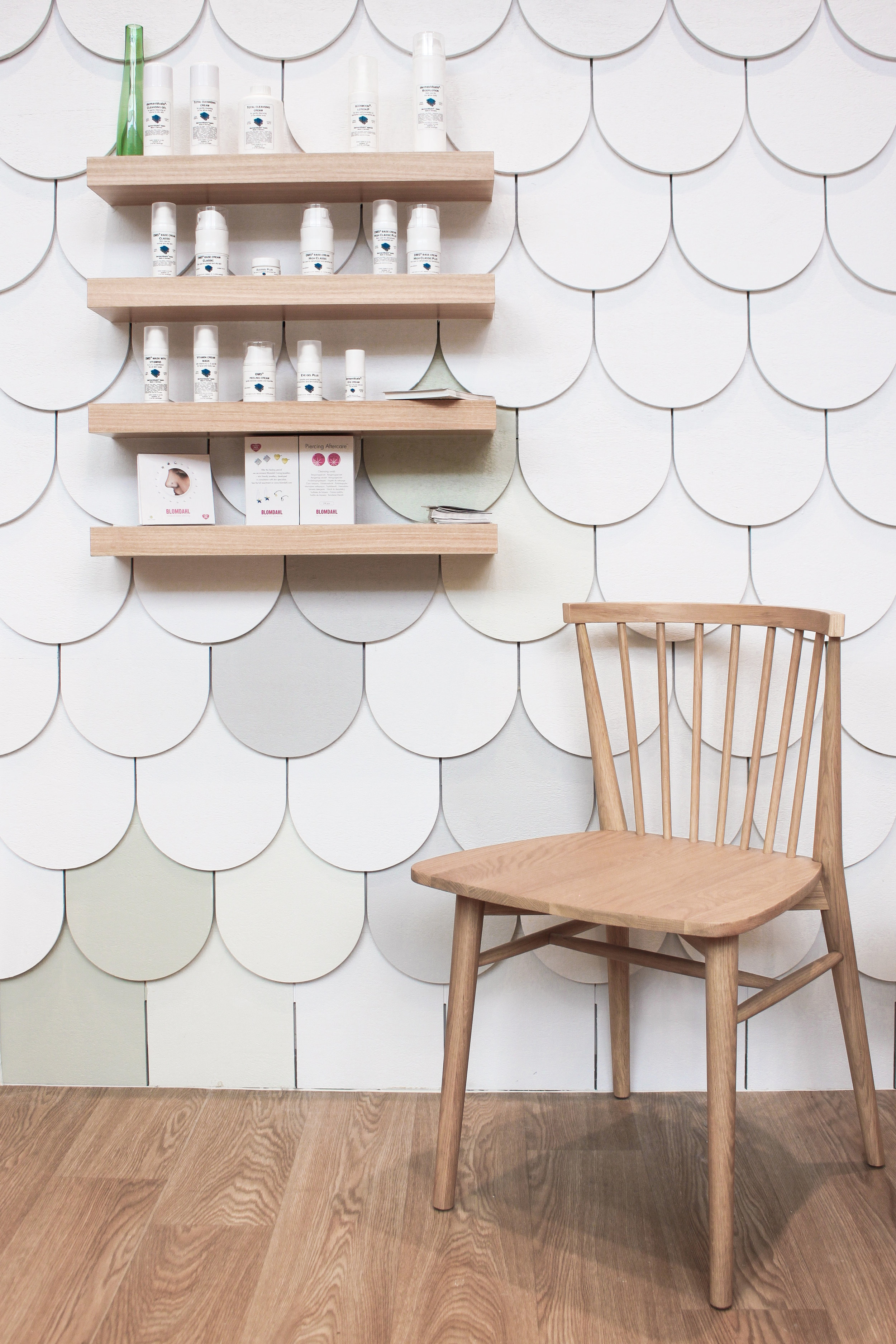
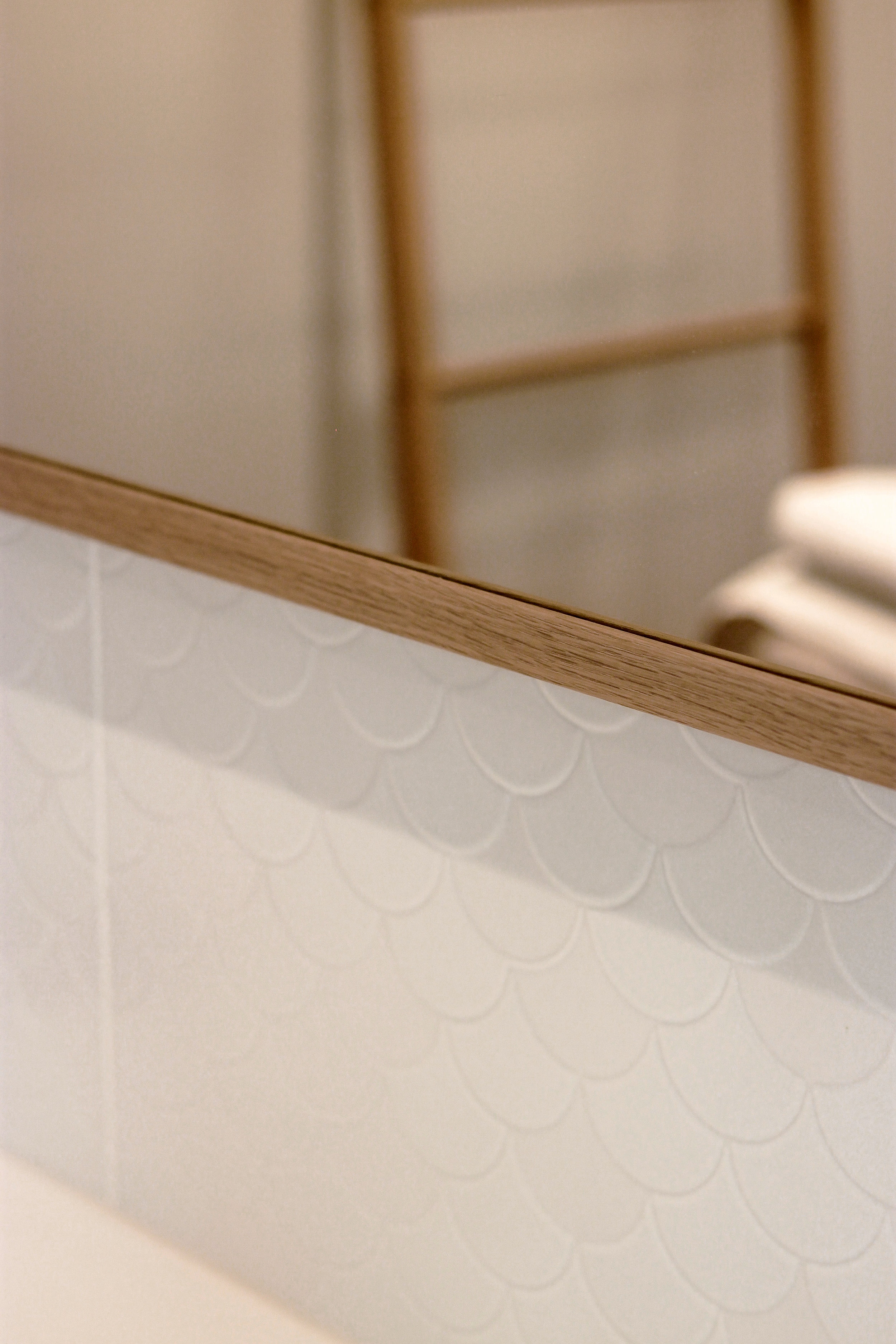
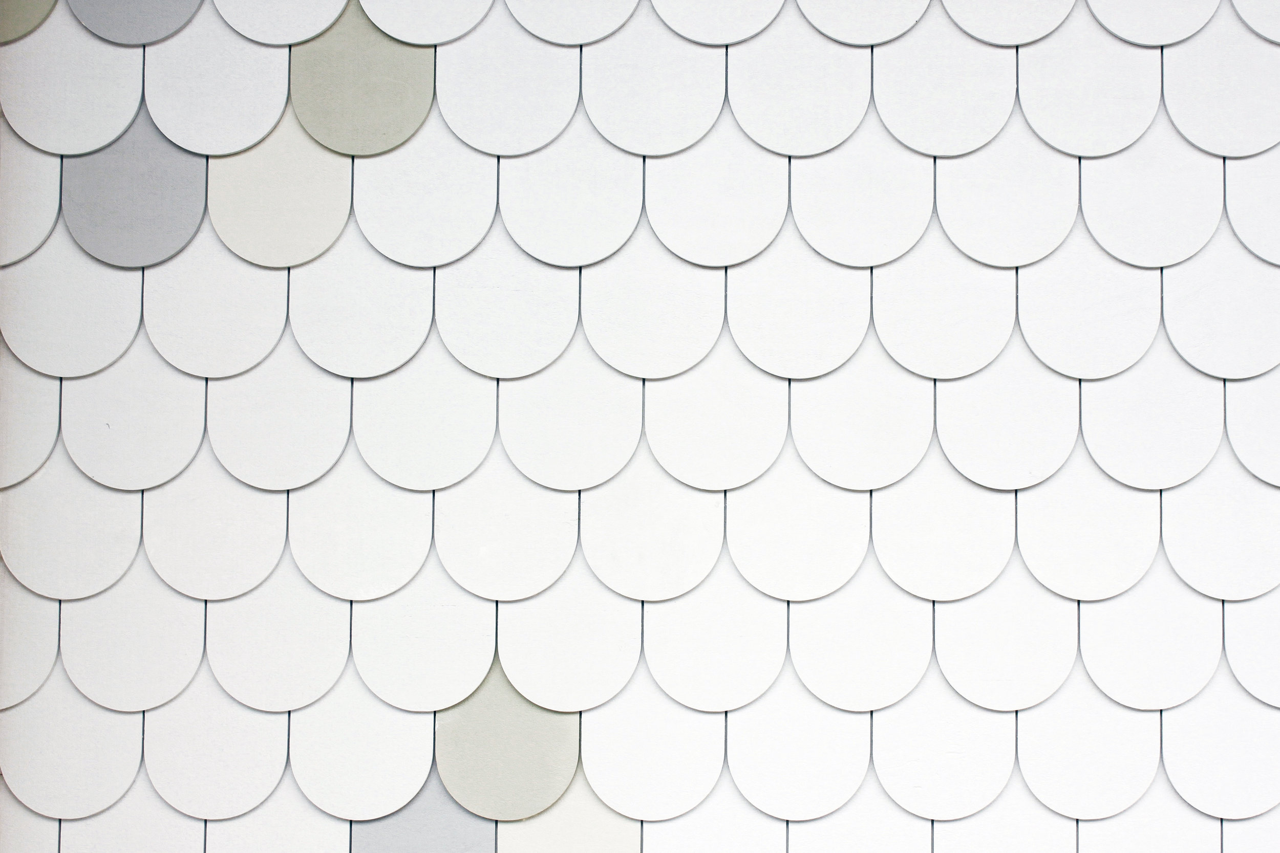
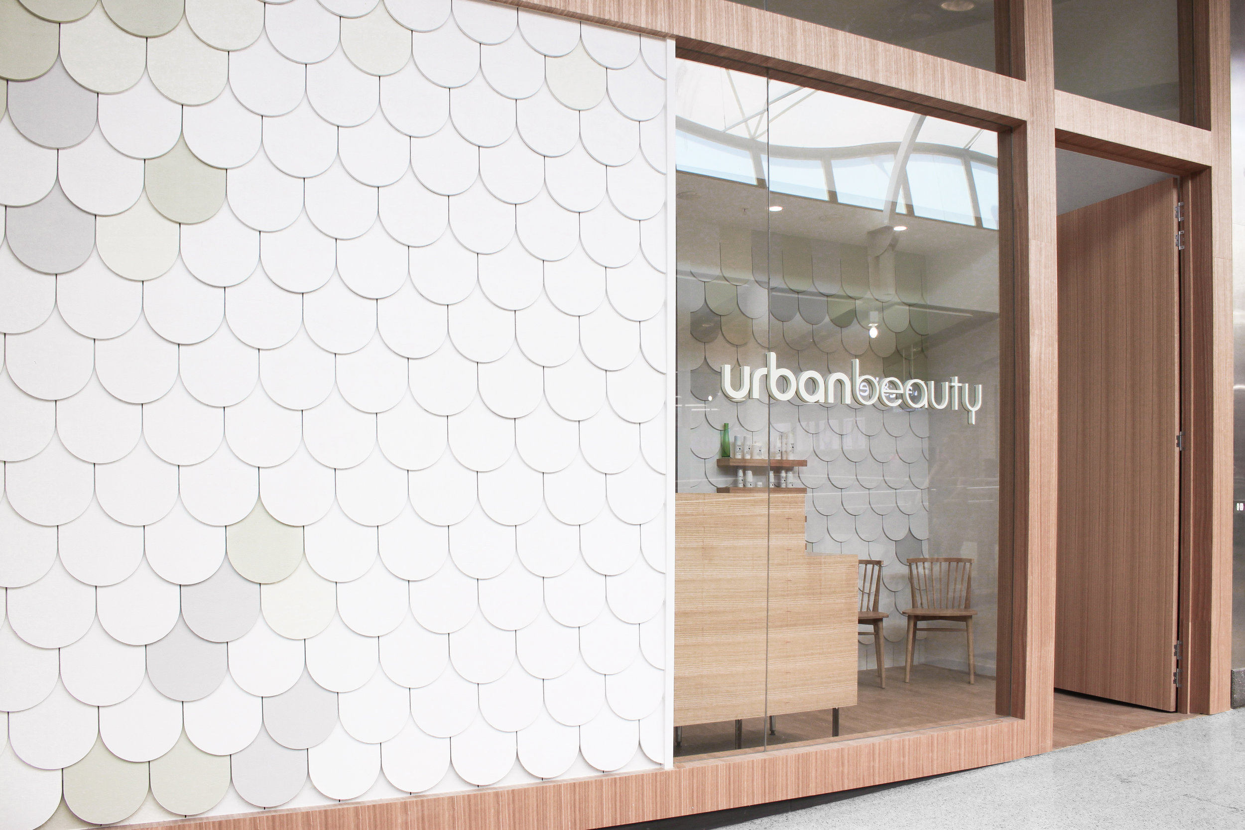
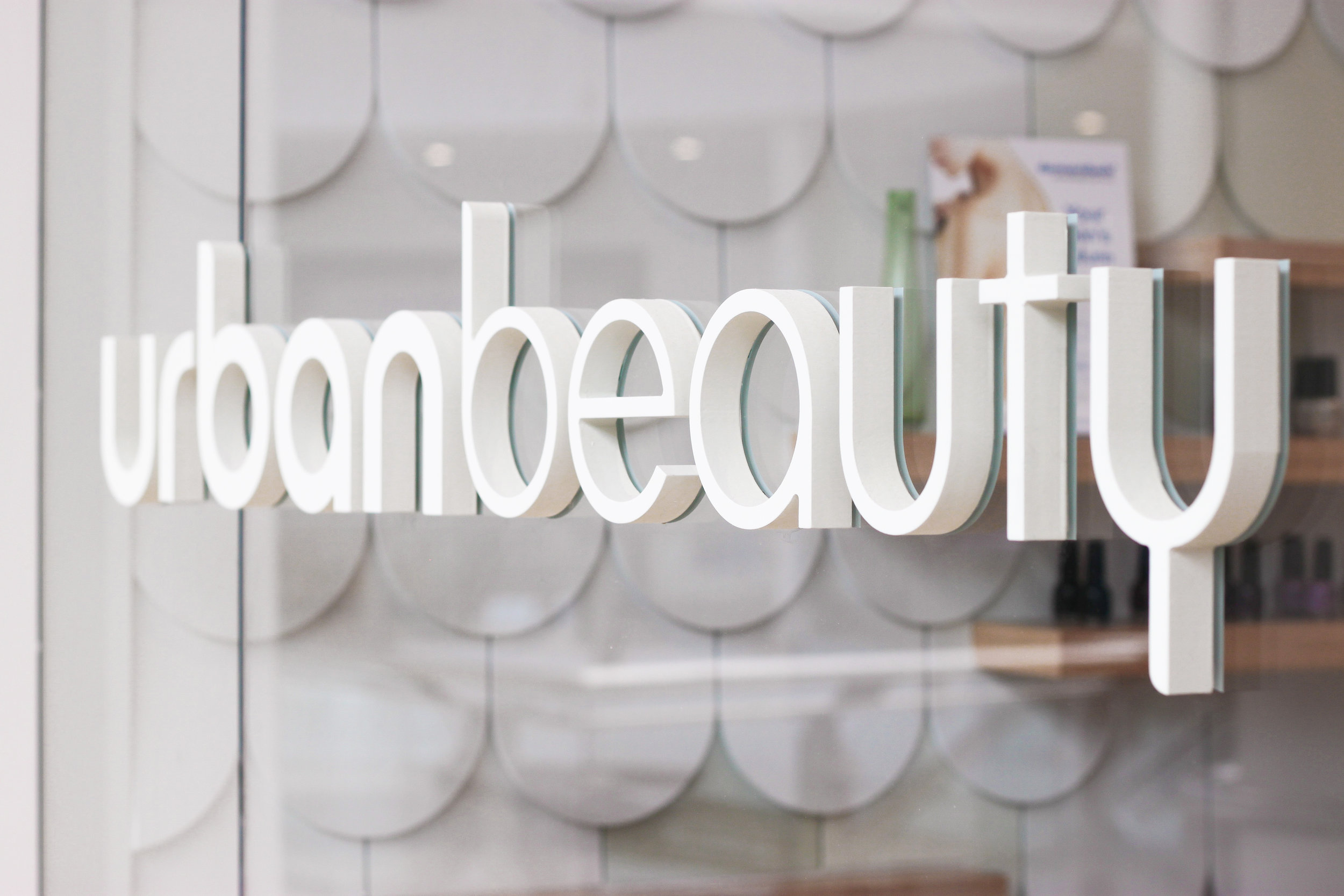
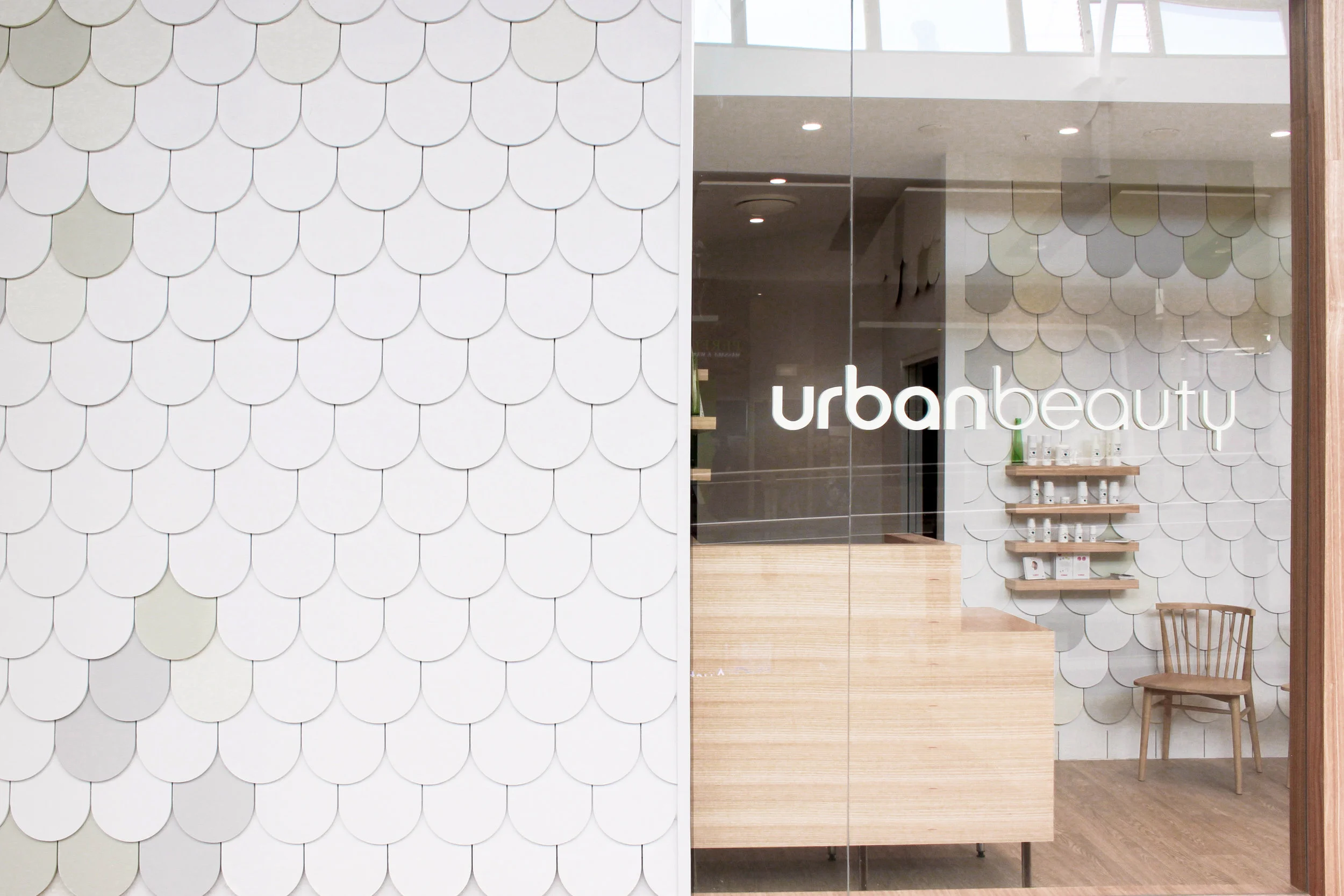
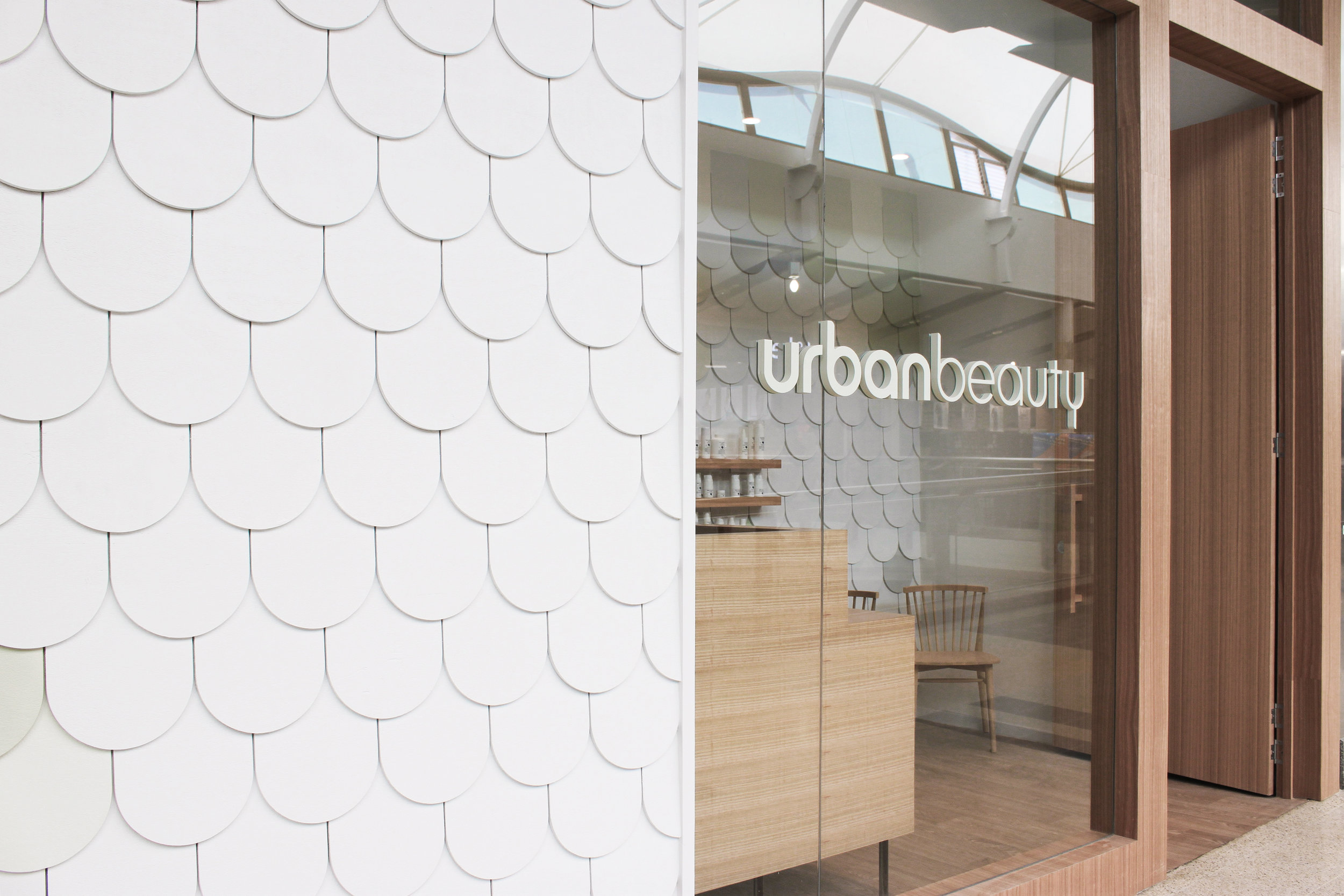
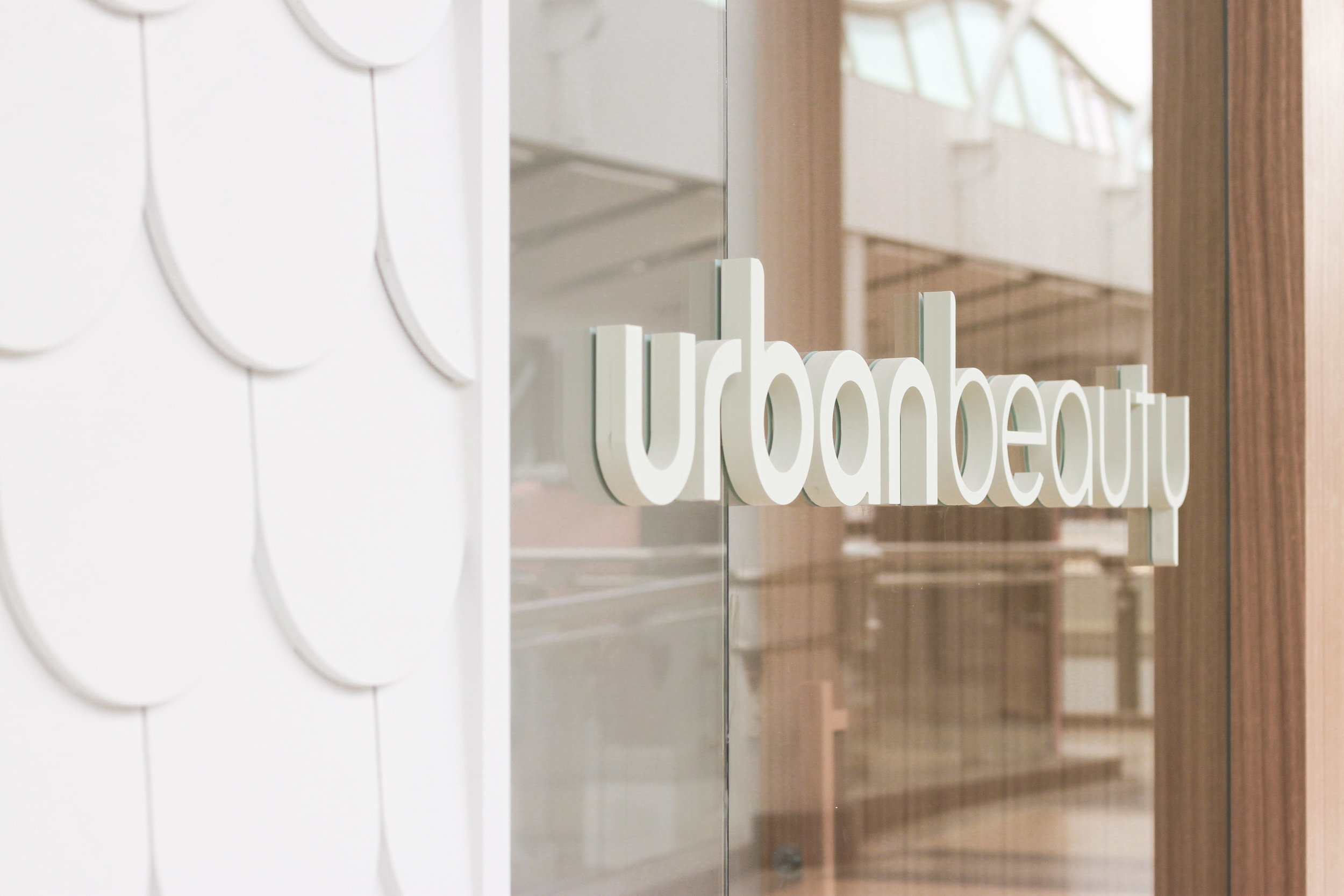
Clean and modern is what you get before you even step through the doors. Inspired by urban dwellings, the shop front has been clad with curved timber shingles that create a welcoming and uniquely fresh introduction. The clean white paint and subtle colour softens the space and ties into the Urban Beauty branding.
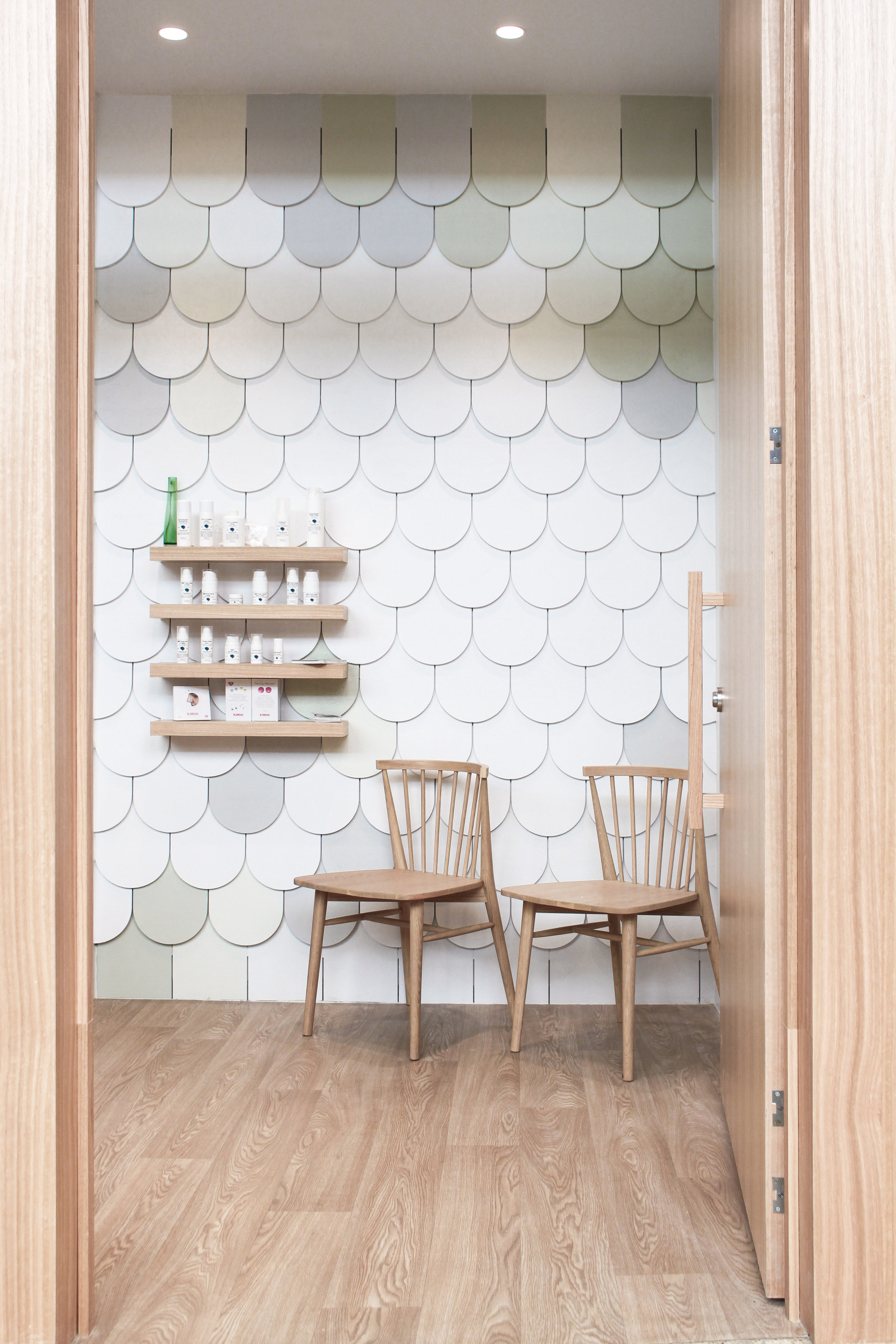
Inside, the salon feels much bigger than it really is. To make the space feel lofty and open, the ceilings in the reception area have been lifted as high as possible, and white walls open up the space even more. To create a more cozy and intimate feeling inside the treatment rooms, the ceilings are lowered again. Timber finishes throughout including warm oak flooring, furniture and fixtures give the salon a clean and modern Scandinavian look.
Because the budget for this project was limited, we designed an efficient layout that reduced the need for major building, plumbing and electrical works. We retained the existing shop front too, but freshened it up by recladding it and building a new door. The result is a fresh and welcoming oasis from the hustle and bustle of everyday life that optimises space.
For more information about Urban Beauty, visit their website. To find out how aplin creative could give your work space a makeover, contact us now.
URBAN BEAUTY Design Direction
URBAN BEAUTY Feature Cladding
URBAN BEAUTY Shop Front

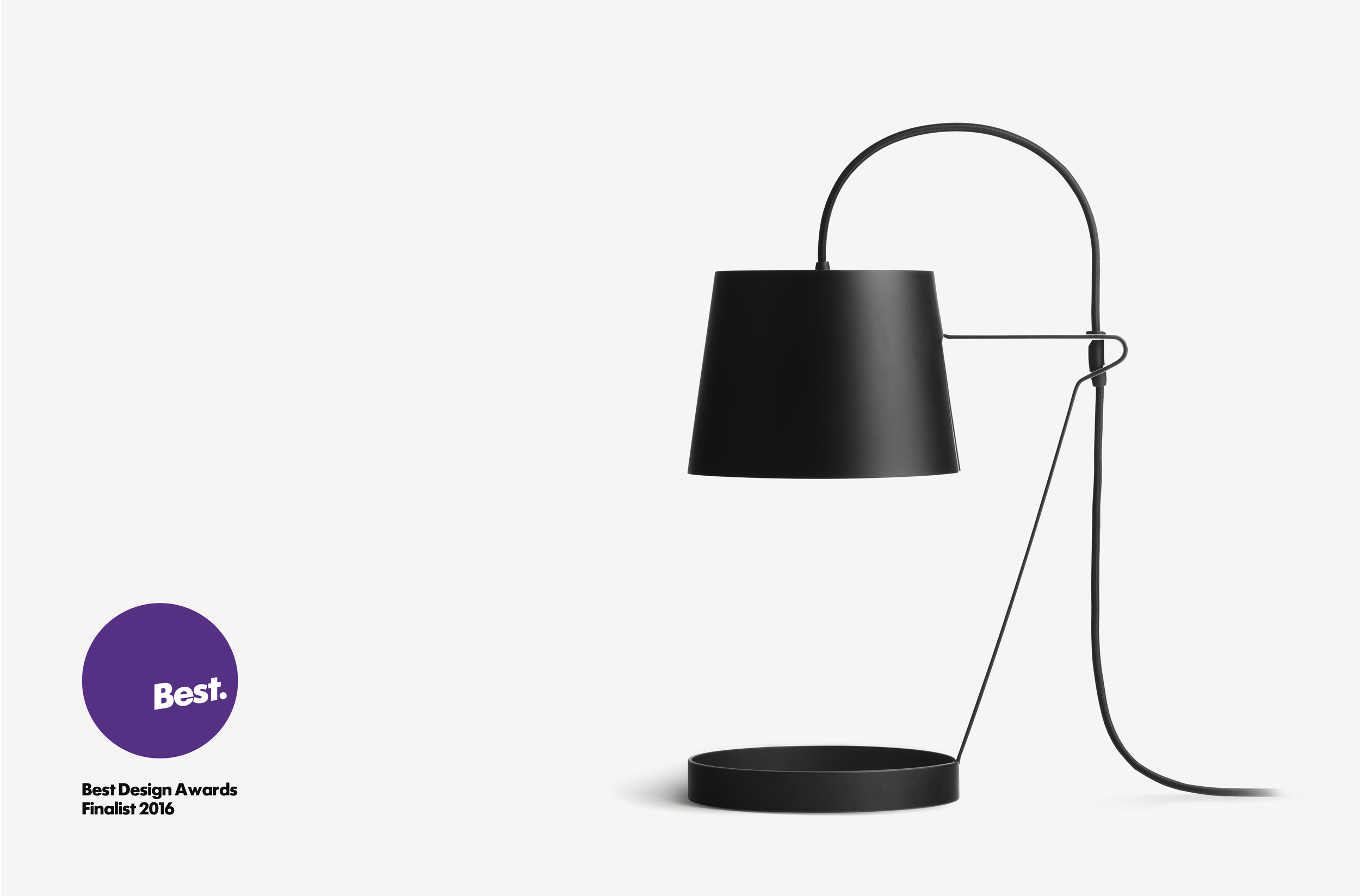
LIGHT announced as 2016 BEST AWARDS finalist
aplin® creative is excited to be part of the upcoming 2016 BEST AWARDS in New Zealand.
Being part of this long running prestigious design event has been an aspiration for aplin® creative and we are very proud to stand alongside the best of New Zealand design.
An initiative of The Designers Institute of New Zealand, The Best Design Awards is the annual showcase of excellence in graphic, spatial, product and interactive design.
Entries judged Best in each category are awarded the Gold Pin, whilst the very best project in each discipline will be awarded the supreme, Purple Pin for work that raises the bar of New Zealand design.
For more information visit: bestawards.co.nz
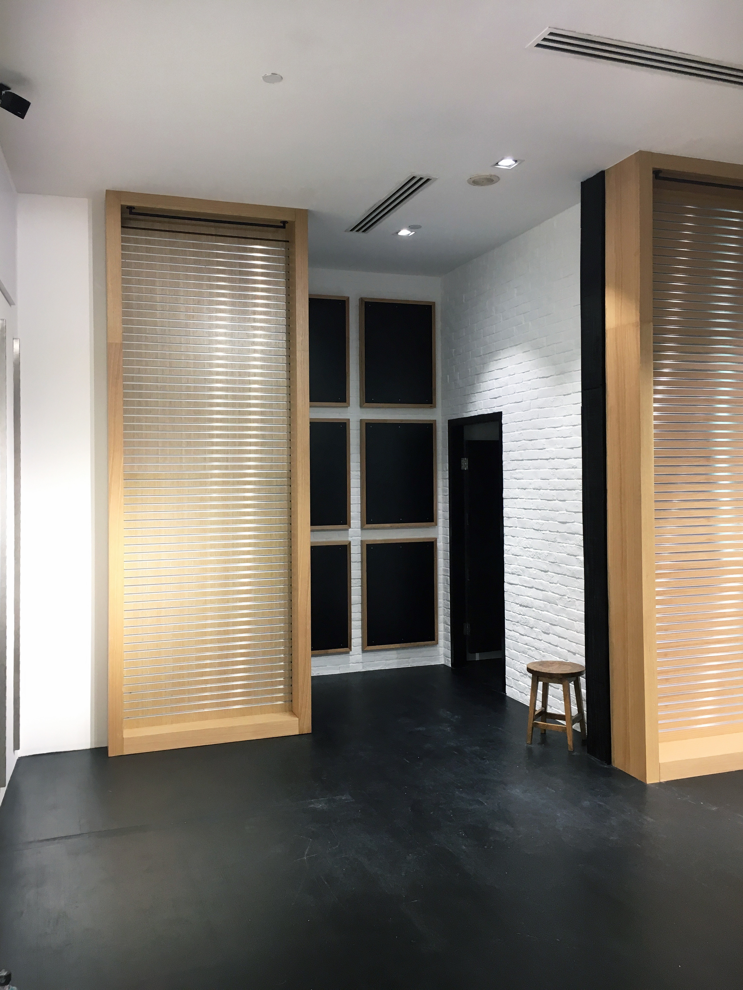
Billabong South-East Asia & the Middle East
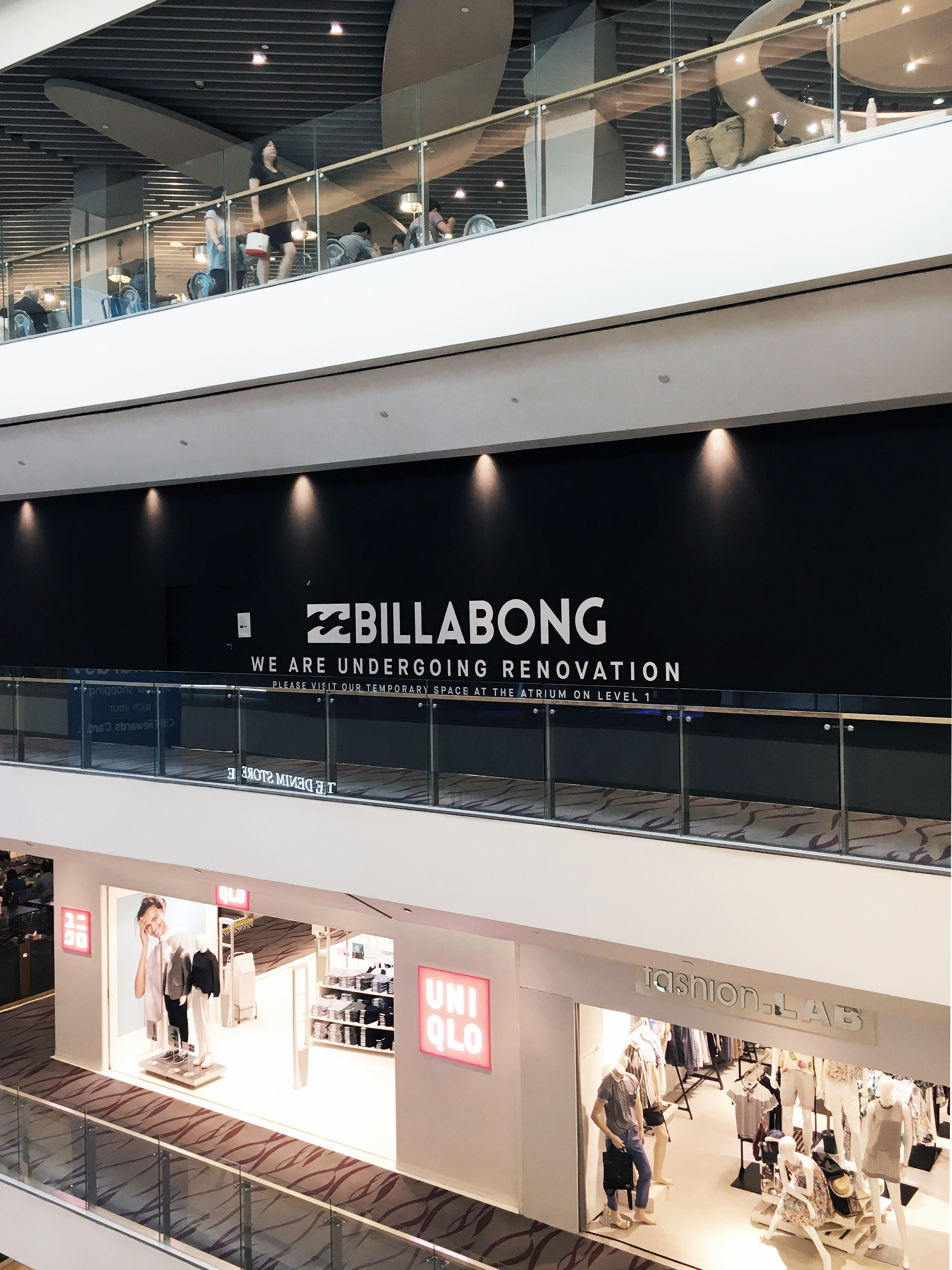
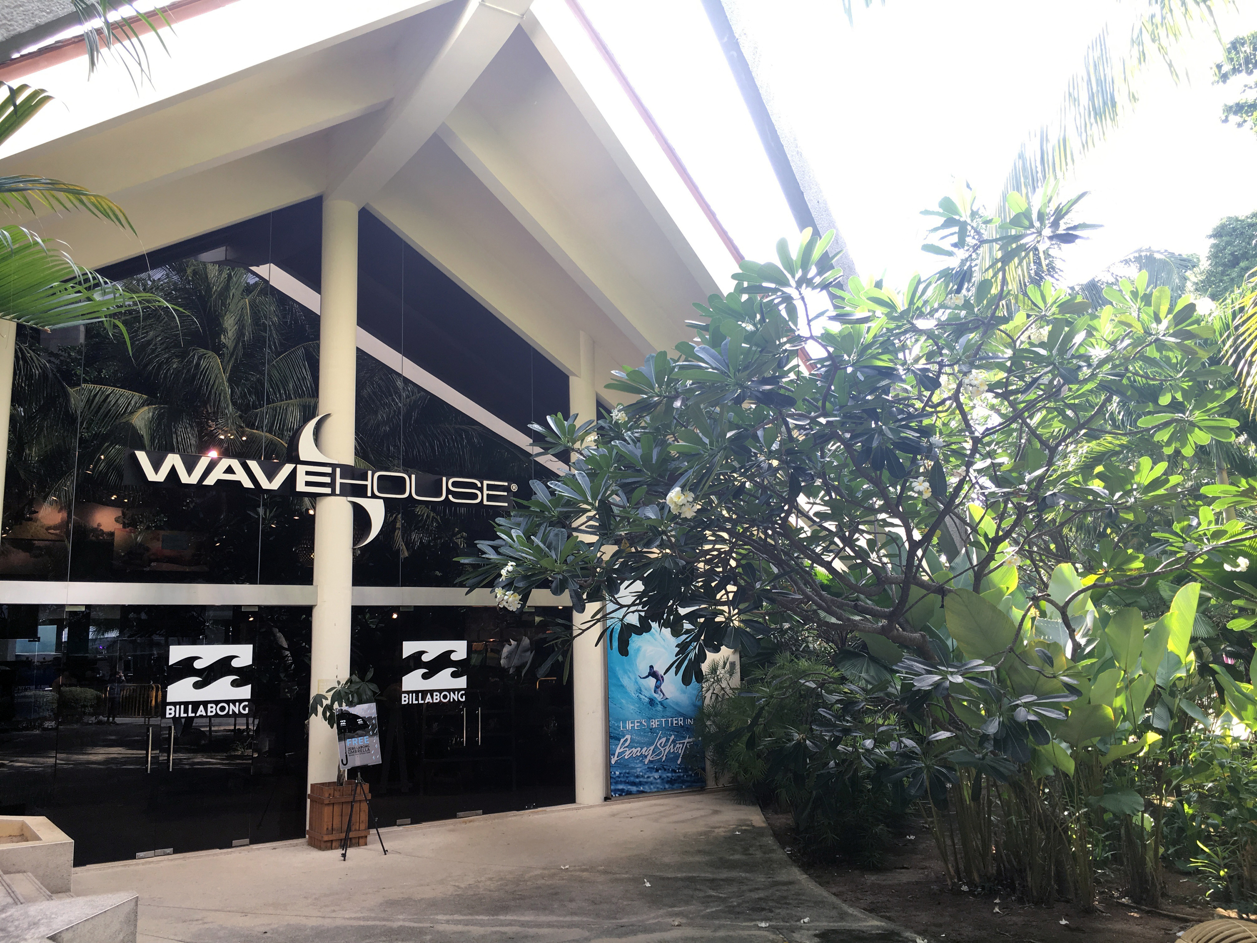
The iconic Australian brand, Billabong, is already one of the largest surf and lifestyle brands on earth, but they’re taking one giant leap toward total world domination with the rollout of more than 10 stores throughout South-East Asia and the Middle East, including Indonesia, Singapore, Oman, Dubai, Thailand and Saudi Arabia. After being commissioned to rebrand other Billabong stores throughout Australia, aplin creative is proud to be leading the stores’ creative direction in these new markets too.
Renowned for their surf, swim and street wear and accessories, along with a traditionally casual tone and ideology, Billabong wanted to create a simple yet strong and sophisticated retail design in their new stores in order to appeal to a broader customer base.
First impressions count, therefor aplin creative chose to keep Billabong’s recognisable black timber entrance. However, we have created a more sophisticated look by using beautiful oak lining boards with black staining, extending it back into the store and complementing it with slate flooring. Sophistication was on the agenda for the storefront branding too, with black nickel metal lettering and strong back lighting. The black on black effect creates a confident, clean and bold statement. Digital media and a basic, but well-merchandised window display completes this simple yet striking store entranceway.
Billabong was built around surfing and the outdoors, so when customers step inside the Billabong store they’re immediately met with a powerful ceiling that harks back to the brand’s inherent ideology. aplin creative randomly placed reclaimed surfboards into a ceiling cavity and painted them matte white which creates an amazing depth of texture and reminds customers of the brand’s origins. The boards wrap down the back wall behind the front counter, and an oversized Billabong logo creates a impressive focal point within the store.
When it comes to interior finishes, the brief was to allow the bright merchandise and lifestyle graphics to tell Billabong’s story rather than relying on the shop itself. Most walls are finished in white paint or simple textures like brick, so the interior space feels light and fresh. The flooring is a rich but simple oak that complements the shop front and other timber fixtures inside.
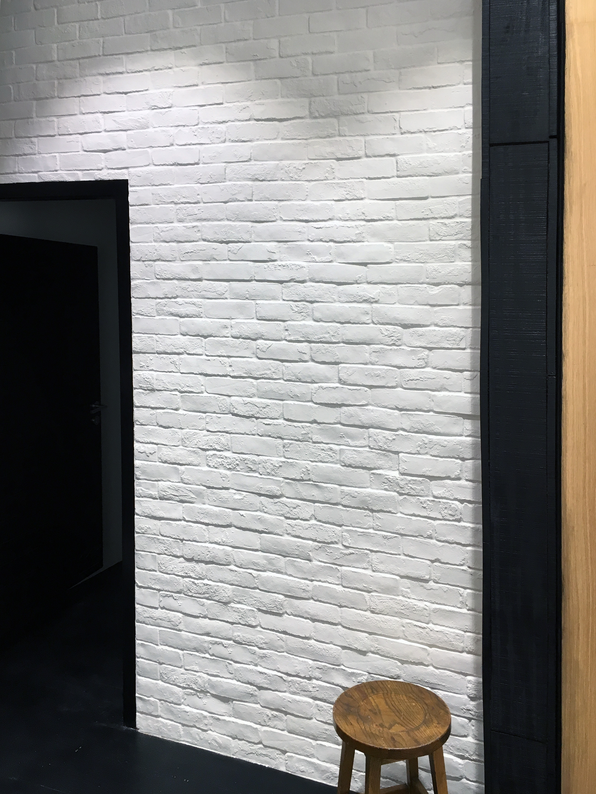
To create a sophisticated retail experience, the fitting room area is textured with white brick and is complemented with full-height steel and glass doors. An open outdoor feel that supports Billabong’s ideology is achieved by beautiful textured sisal carpets and coastal Pandanus plants scattered amongst the fitting room area.
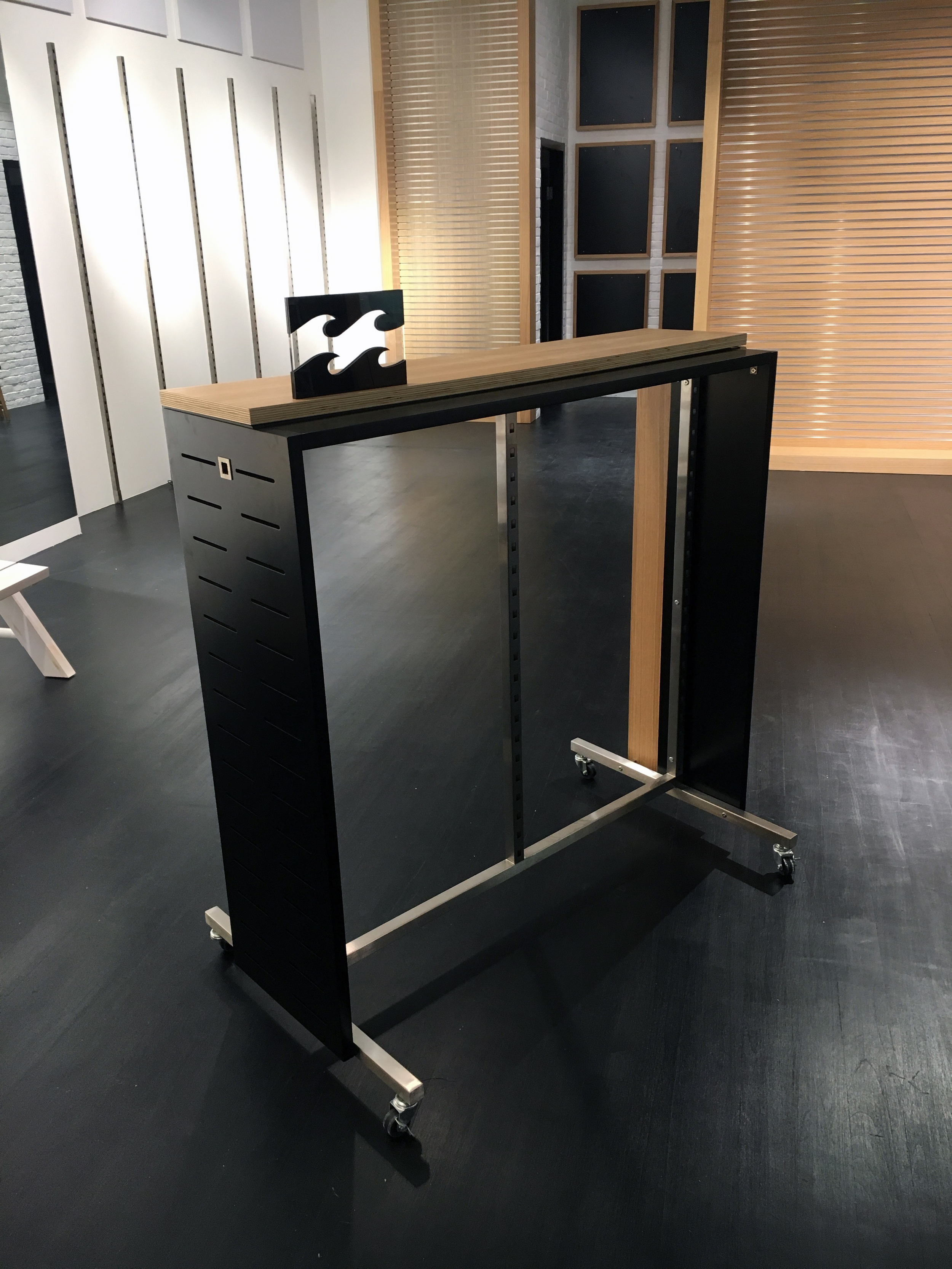
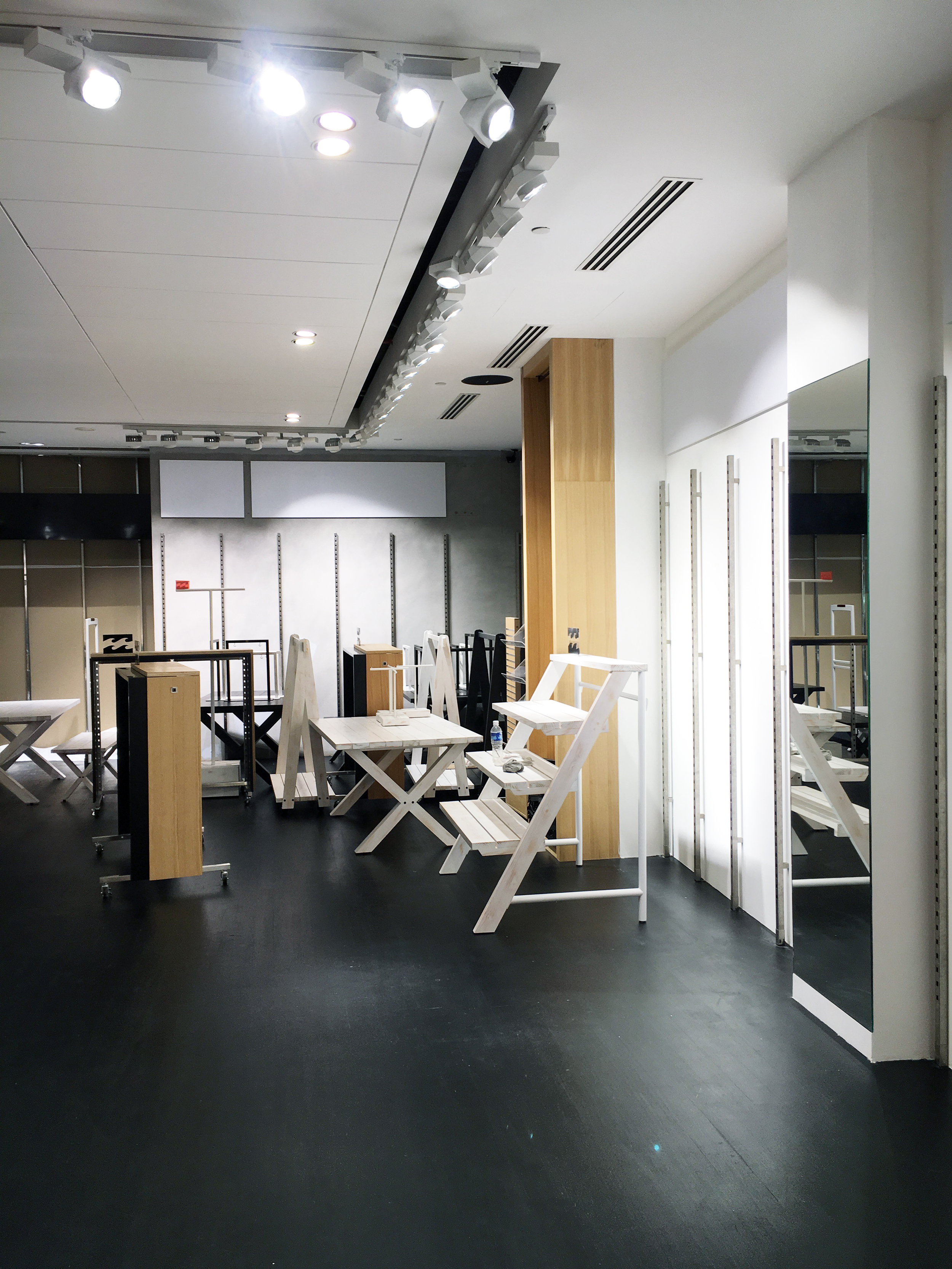
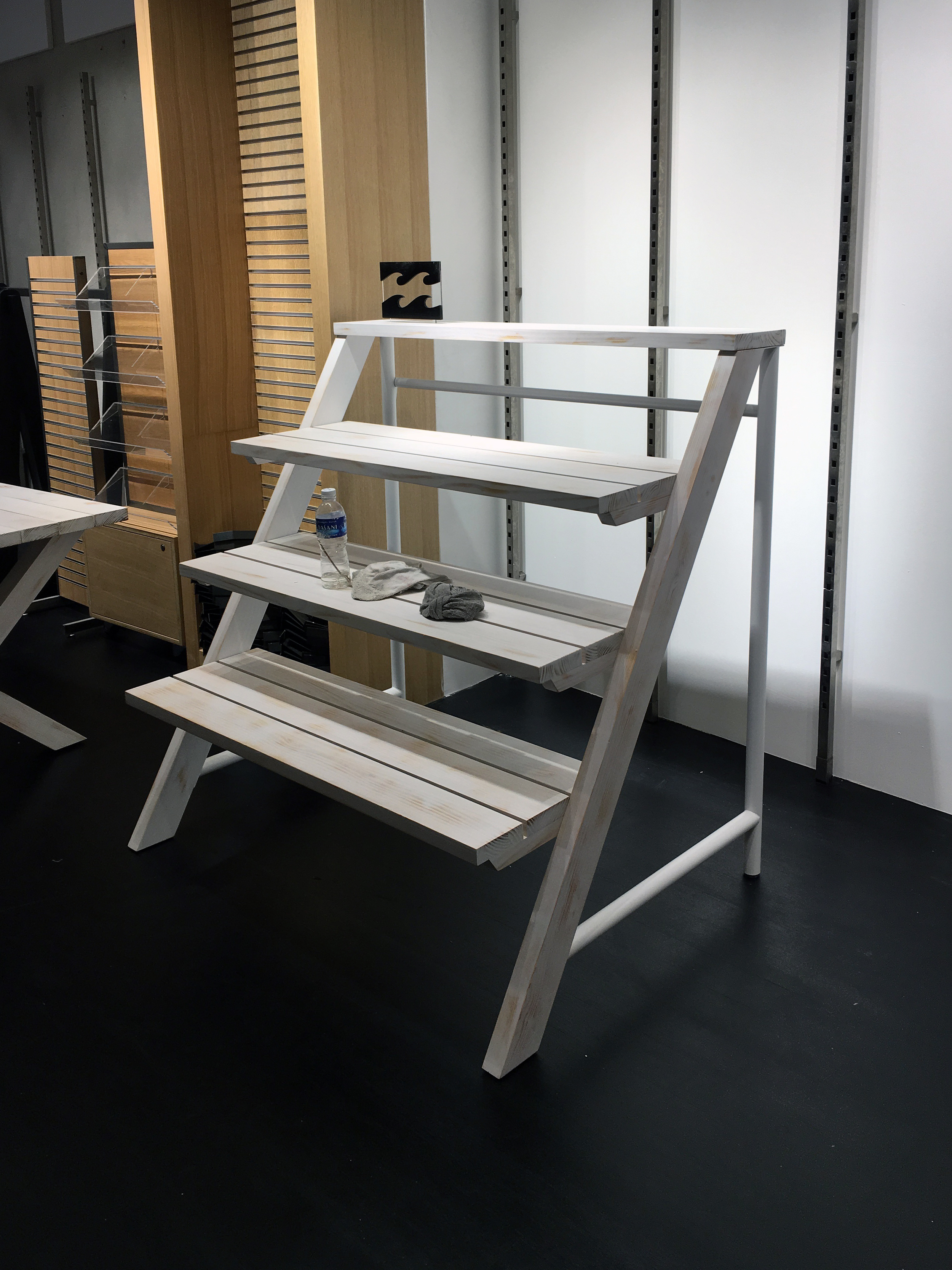
Billabong’s fixtures maintain this simple and clean brief too. Textures and limited finishes in both men’s and women’s departments create a clean backdrop for Billabong’s bold apparel. Full-height alcoves help customers effortlessly find what they’re looking for, and ensure all products on display are clean and identifiable.
For more information about Billabong, visit their website. To find out how aplin creative could help your store fit-out, contact us now.
LIGHT by aplin creative ANNOUNCED AS A VIVID DESIGN COMPETITON FINALIST
LIGHT by aplin creative is proud to be named as a finalist in the 14th annual VIVID Design Competition.
Presented by Decor+ Design and celebrating some of the most dynamic emerging Australia designers, the VIVID (Vibrant Visions in Design) Design Competition is Australia’s longest running design competition.
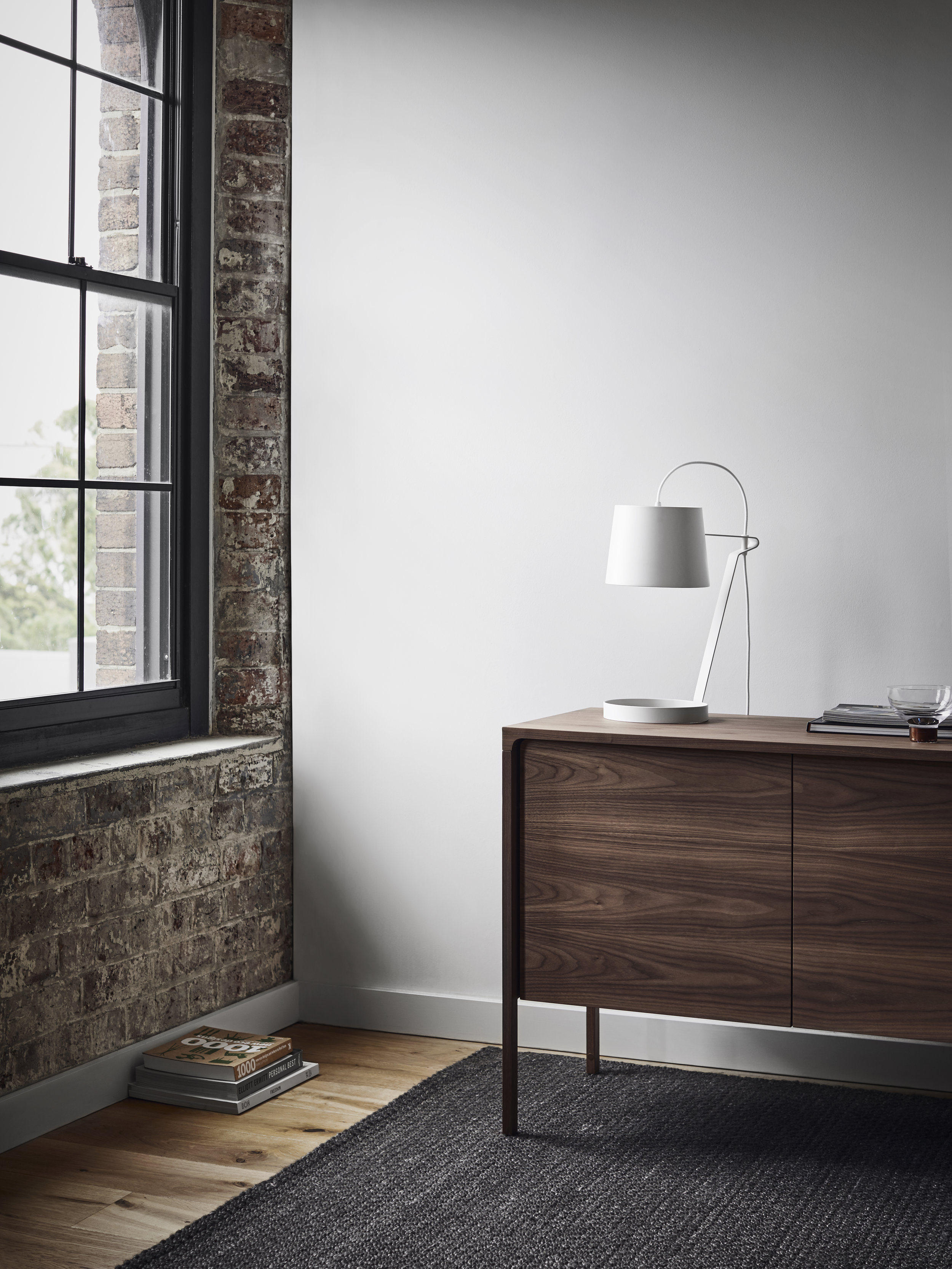
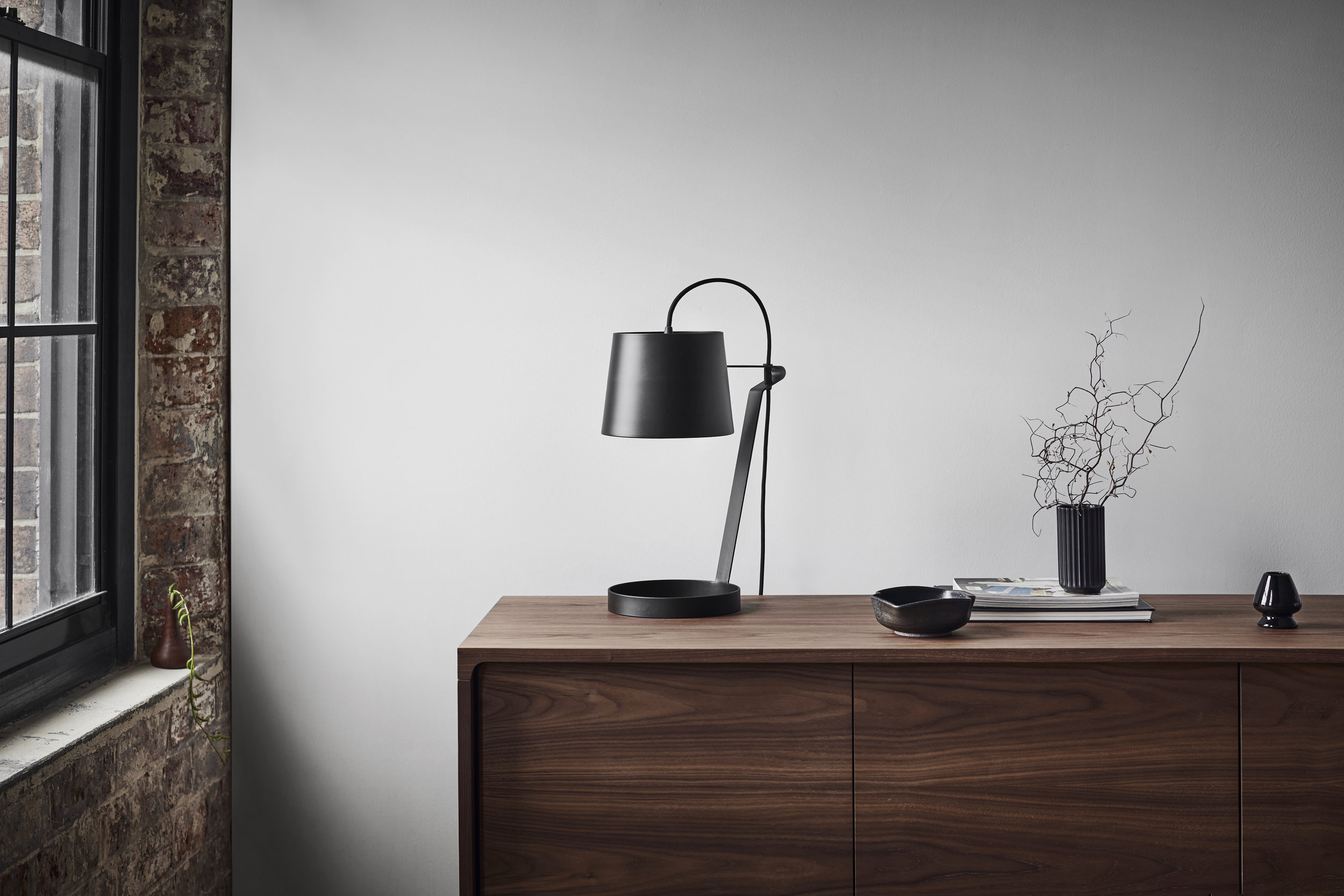
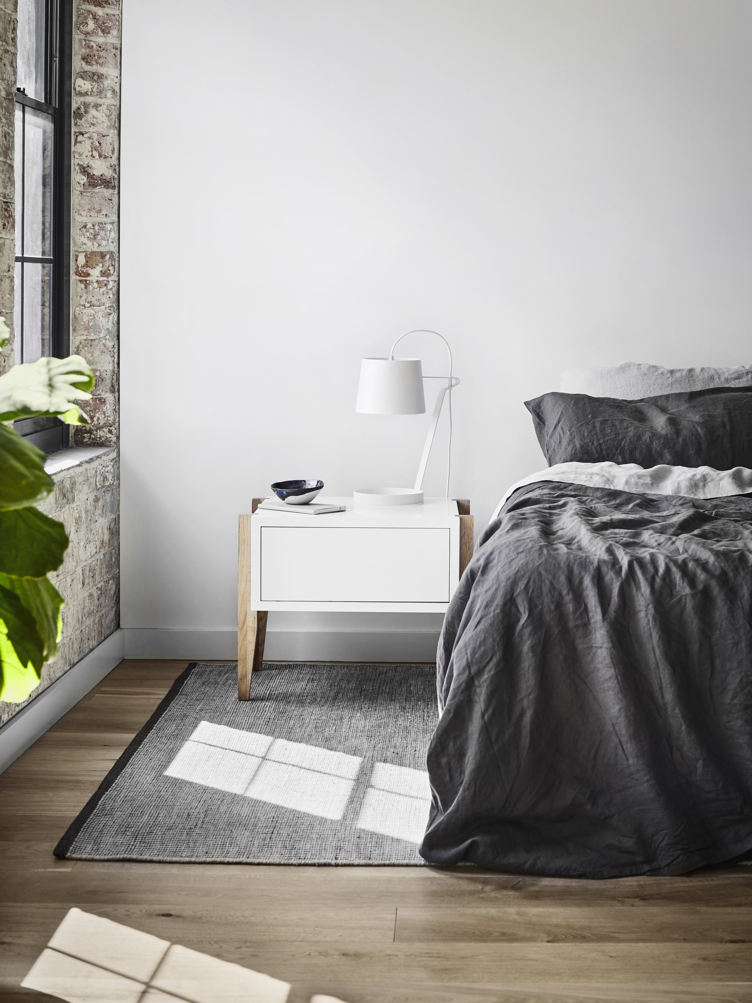
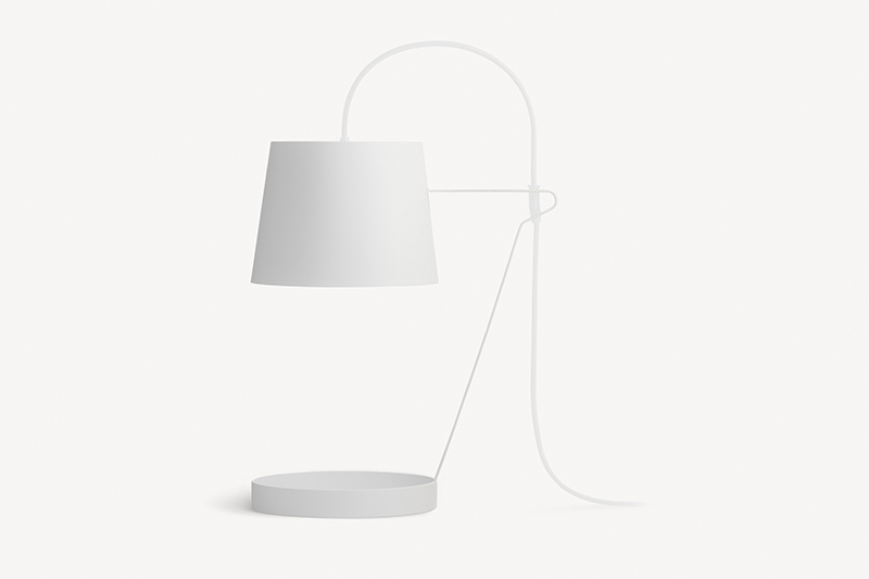
LIGHT by aplin creative is a sophisticated table lamp that creates atmospheric light and adds character to its environment. aplin creative’s lamps are designed to complement any interior by adding a functional statement.
Over the last 10 years aplin creative founder Chris Aplin has worked as an interior and industrial designer. Chris follows a process that generates, communicates and executes creative solutions for clients across a wide range of industries.
The finalists of the 2016 VIVID Design Competition will be on display at Decor + Design, Australia's number one interior event that showcases the latest interior products and furnishings from the nation's leading brands. Finalists will be on display at the Melbourne Convention and Exhibition Centre from 21-24 July 2016, and the winners will be announced on Friday 22nd July.
For more information visit www.decordesignshow.com.au/vivid.
aplin creative wins 2016 GOOD DESIGN Award
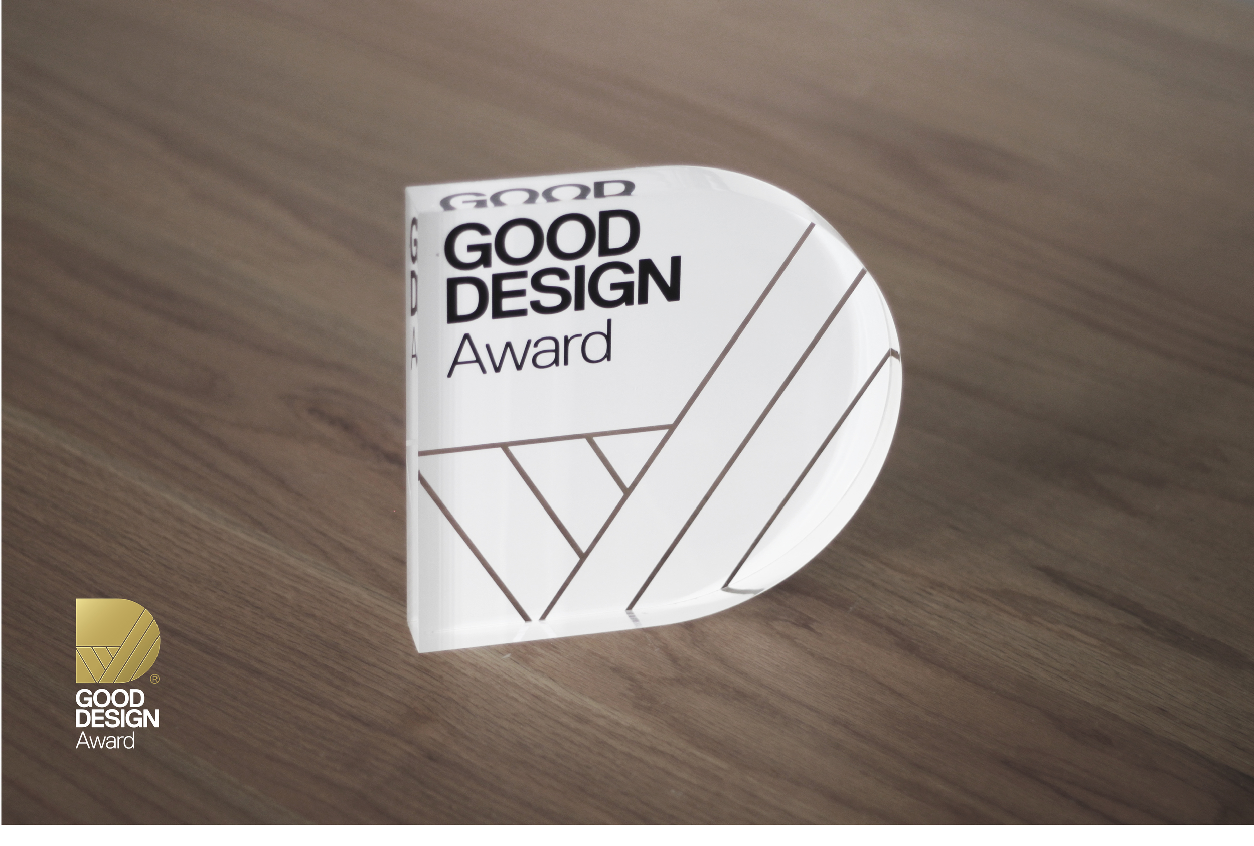
The Good Design Awards is one of the longest standing and most prestigious design awards in the world, promoting excellence in Australian design and innovation. aplin creative is proud to have been acknowledged in the 2016 awards, announced on May 27th.
Established in the 1950s, Good Design Australia focuses on progressively raising the standard of design and innovation in Australia. A panel of Australian and international judges reviewed hundreds of entries across seven categories, including LIGHT by aplin creative which featured in the Product Design: Furniture & Lighting category.
LIGHT by aplin creative is a sophisticated table lamp that creates atmospheric light and adds character to its environment. aplin creative’s lamps are designed to complement any interior by adding a functional statement.
Click here to find out more information about the Good Design Awards and to see the full list of winners.
Australia's Good Design Awards 2016
Australia's Good Design Awards


