BILLABONG the world’s largest surf lifestyle brand opened the doors of its new flagship store at the Melbourne Queen Victoria Village. aplin creative was again proud to lead the creative direction of this store and be the designer.
Melbourne QV is uniquely positioned in a well established shopping and entertainment precinct, located in the heart of Melbourne city. The Billabong site is one of the centers premium street front locations. Due to this, we had to take a more considered approach.
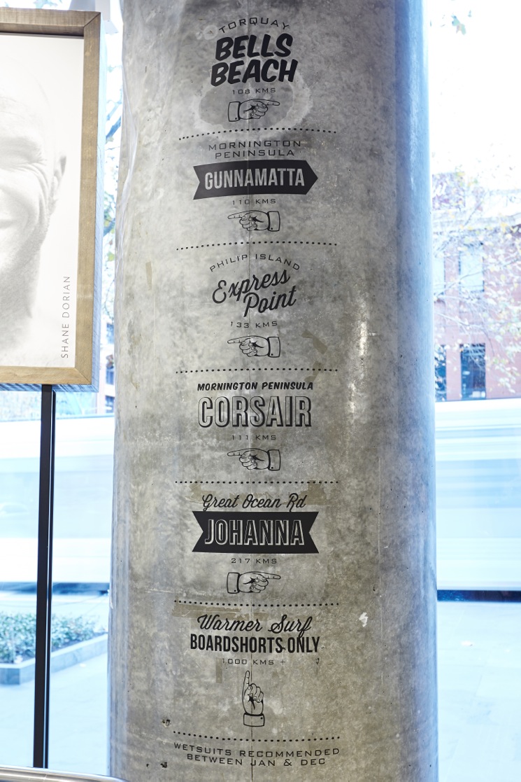
The store needed to be a Billabong flagship but with consideration to the urban culture of Melbourne. We achieved this by using the sites existing architectural elements that reflect the urban environment surrounding it. A good example of this is the large cement walls that we simply finished in a clear liquor to leave the beautiful cement exposed. We also left the structural cement columns within the site exposed. Other great features like the cement floor on the lower levels and the exposed services above the feature ceiling all complement the urban feel that pays respect to Melbourne and the location of this store.
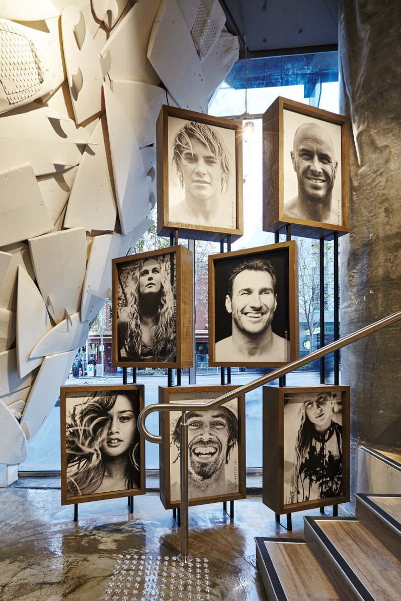
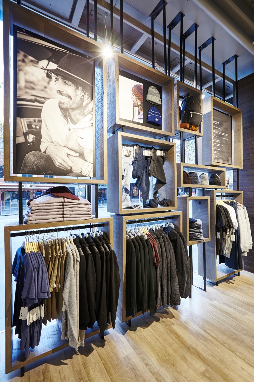
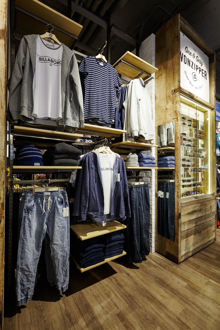
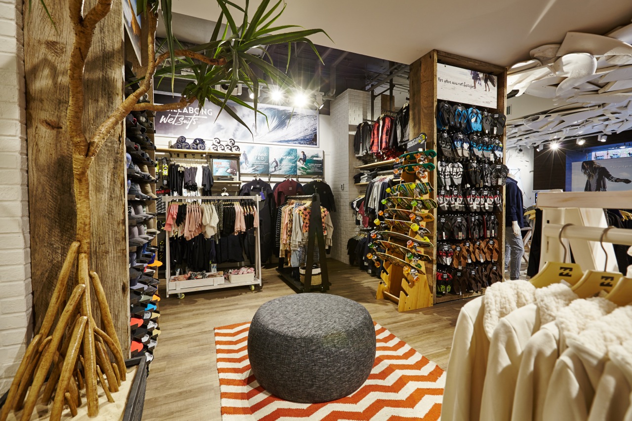
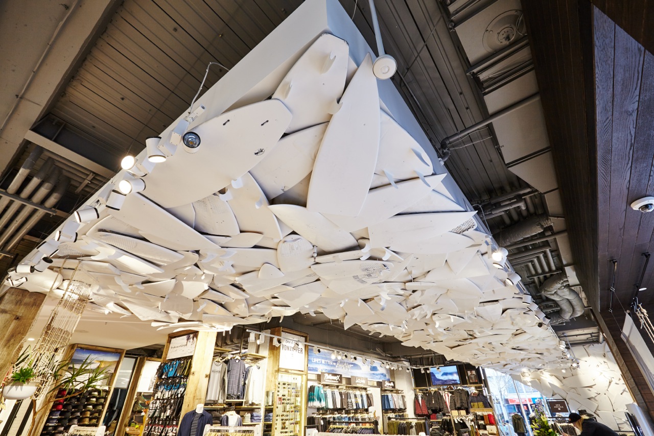
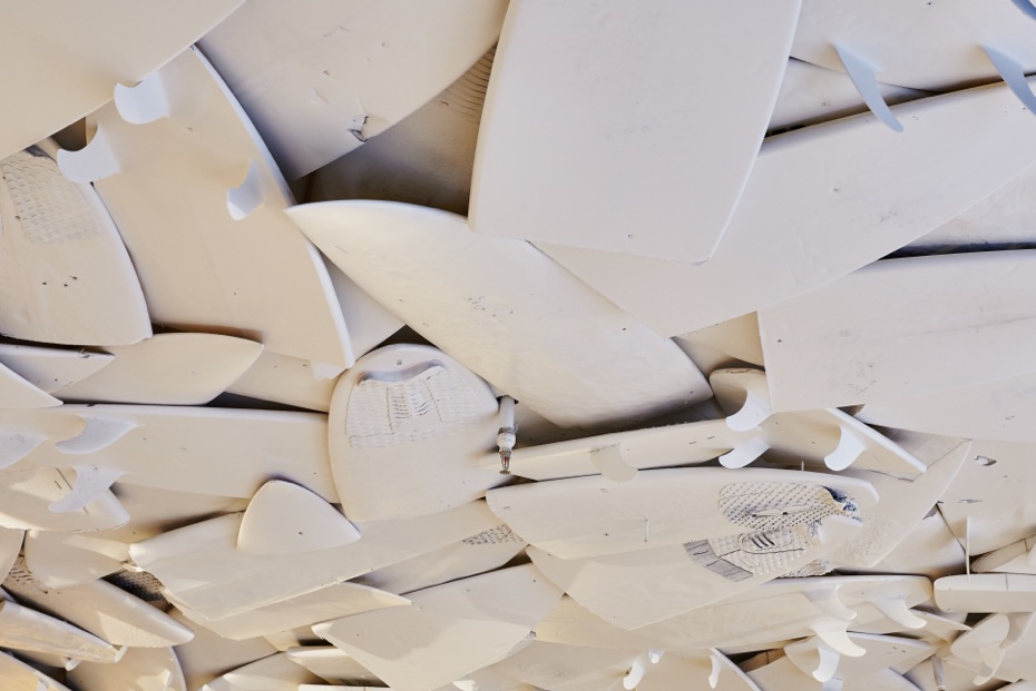
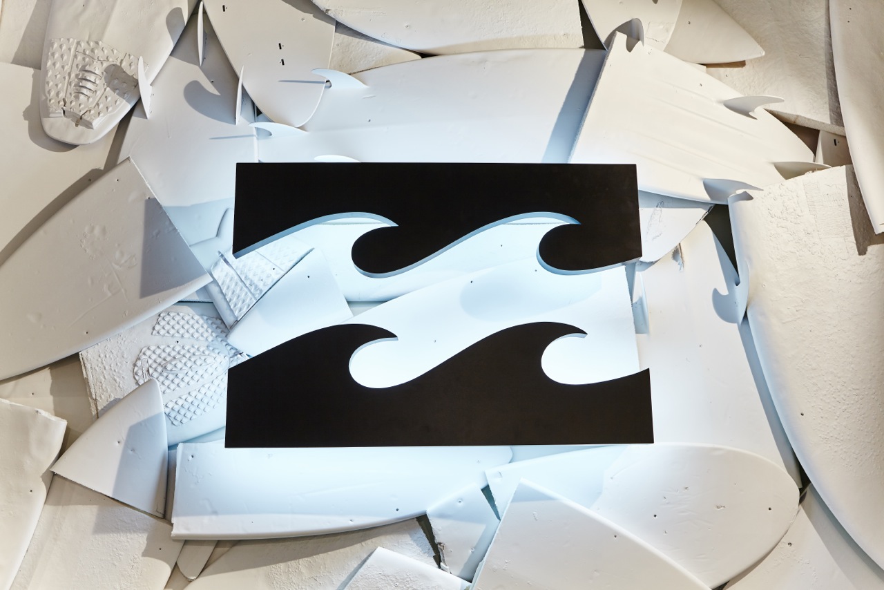
Balancing this urban feel with surf lifestyle is always challenging. With the help of reclaimed timbers for feature walls, fixtures and flooring we created a feeling within the store reflects the brand ideology. We used the now iconic reclaimed surfboard ceiling that wraps down the back wall behind the ‘Point Of Sale’. The boards create a textured backdrop for an oversized Billabong logo, which brings you back to the brands surf origins.
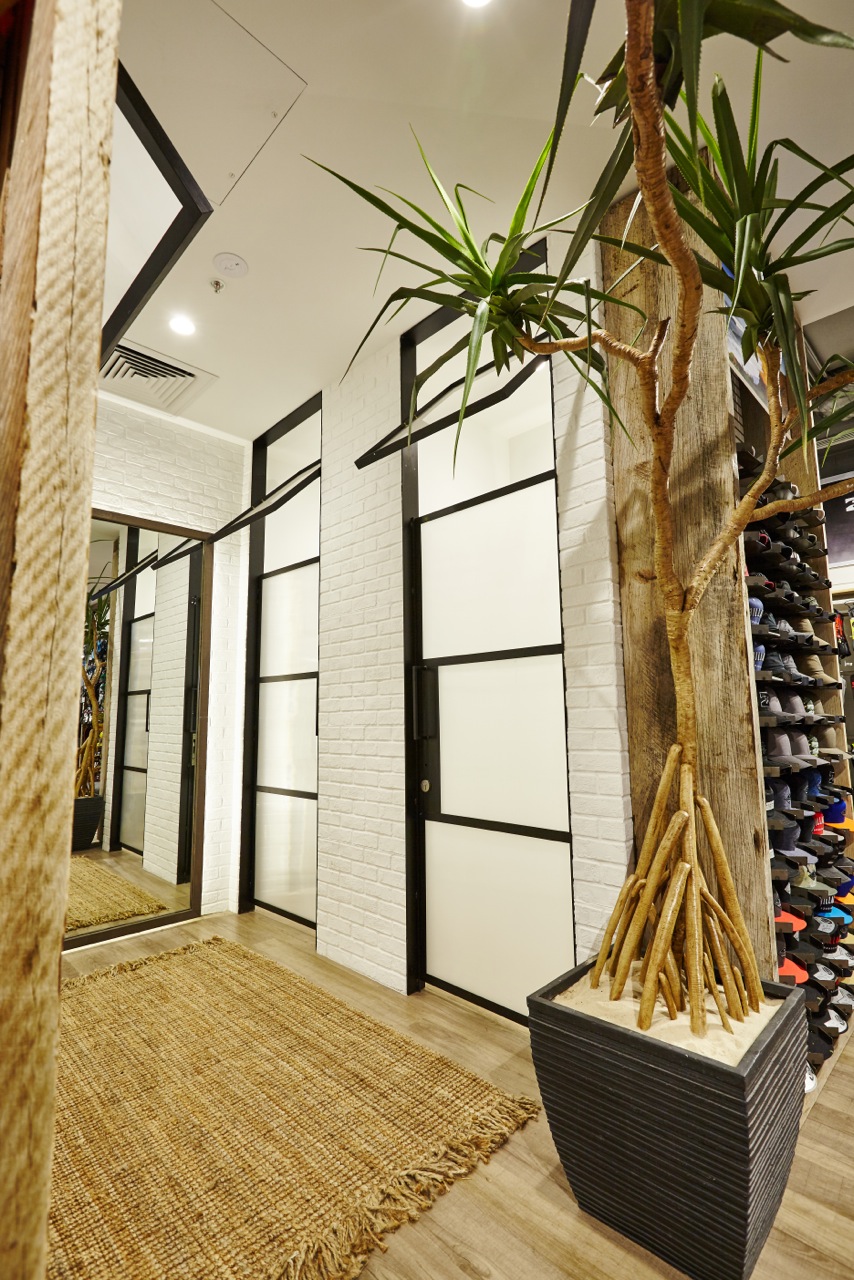
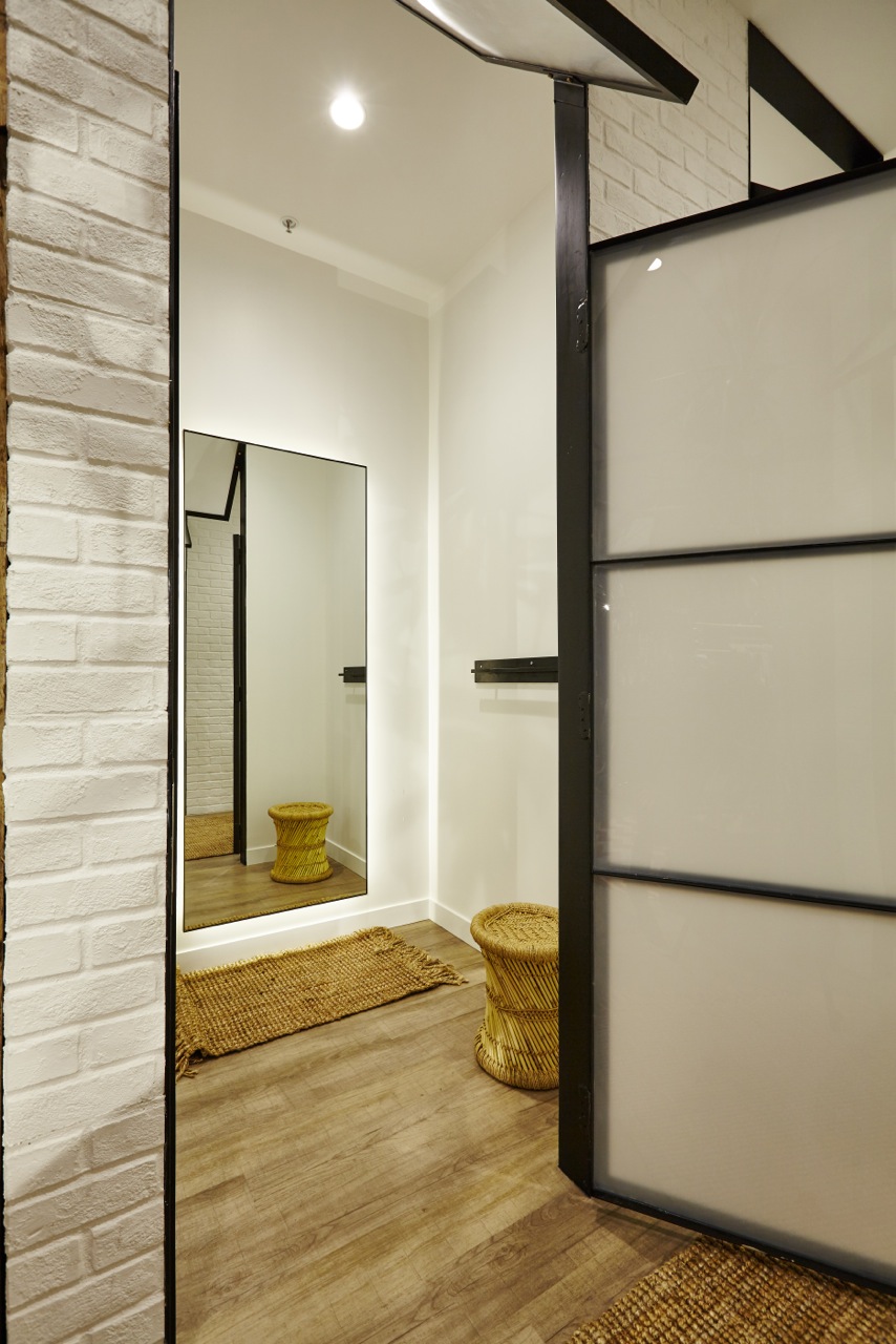
This amazing depth of texture that the feature ceiling creates is a real defining feature of the store. The ceiling leads you to the fitting rooms that are simple and clean. The fitting room areas are textured with white brick and complemented with steel and glass doors. The goal was to bring an outdoors feel to these simple spaces. We then softened them with beautiful textured sisal carpets and coastal Pandanus plants.
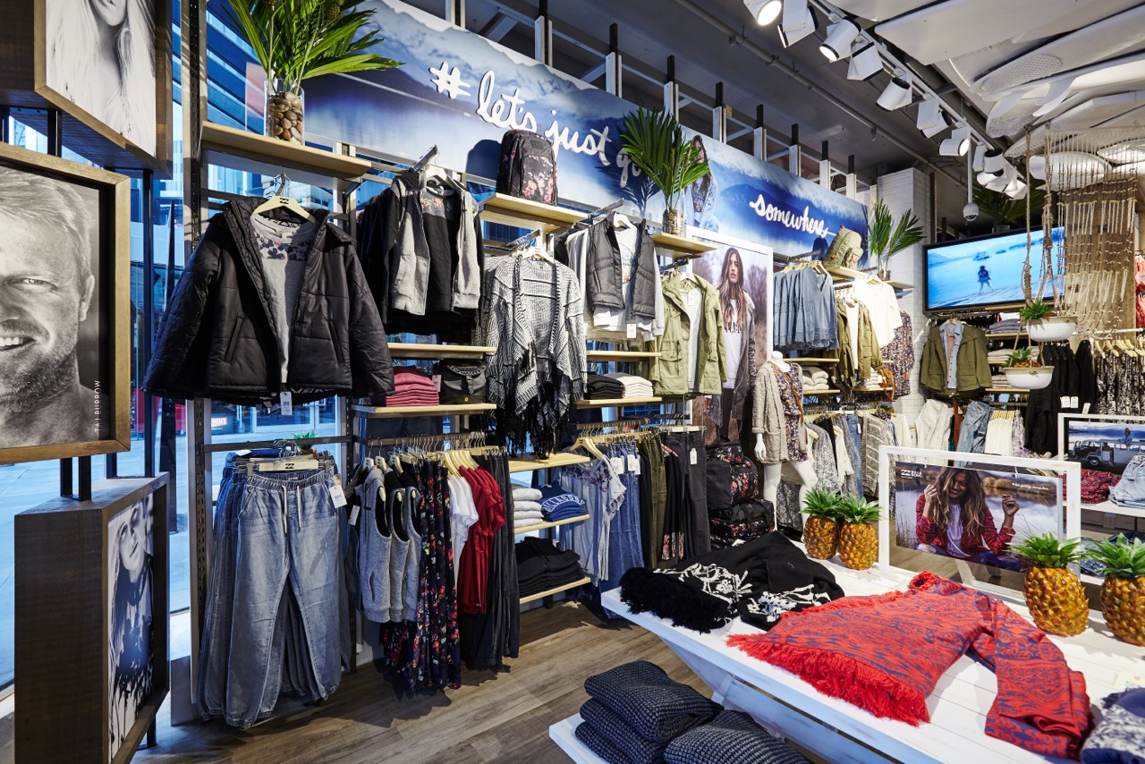
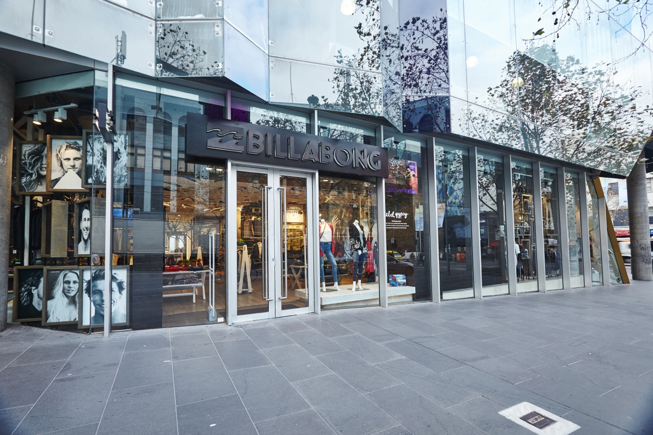
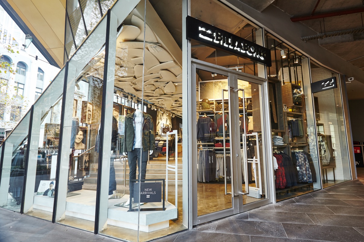
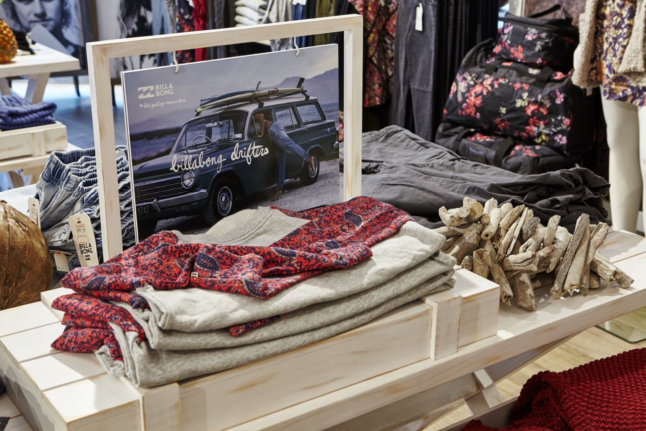
The existing mall facade was retained in this store. So to incorporate the iconic Billabong shop front we built an entry portal inside the store. As you enter the store the iconic black timber extends back into the store to make a threshold or band of solid black. Slate flooring complements and adds contrast to this timber portal. We used beautiful oak lining boards with black stain to achieve this bold entry. The finish of this timber has a strong visible grain and texture but is very clean at the same time. The shop front signage has black on black branding which is a confident, clean and bold statement for Billabong. Digital media and a basic but well merchandised window display complete this striking entry.
This store is the biggest and best so far for Billabong and the Melbourne QV Shopping centre agree with this, awarding the ‘QV Melbourne Retail Excellence Award 2015 Fitout Of The Year’. aplin creative are proud to receive such praise from the team at Melbourne QV and It was a privilege to be involved in the design of another store for this world renowned brand.


